In today’s internet-centric world, it’s just as important to follow design trends as it is to know the trends in your specific industry. And one of the most popular web design trends today is the use of hero images.
From big businesses like Southwest and Nike to smaller brands like Buffalo’s Canalside, hero images are taking over the internet one website at a time.
So, what exactly are hero images? How and why do they work so well? Let’s find out.
What are Hero Images?
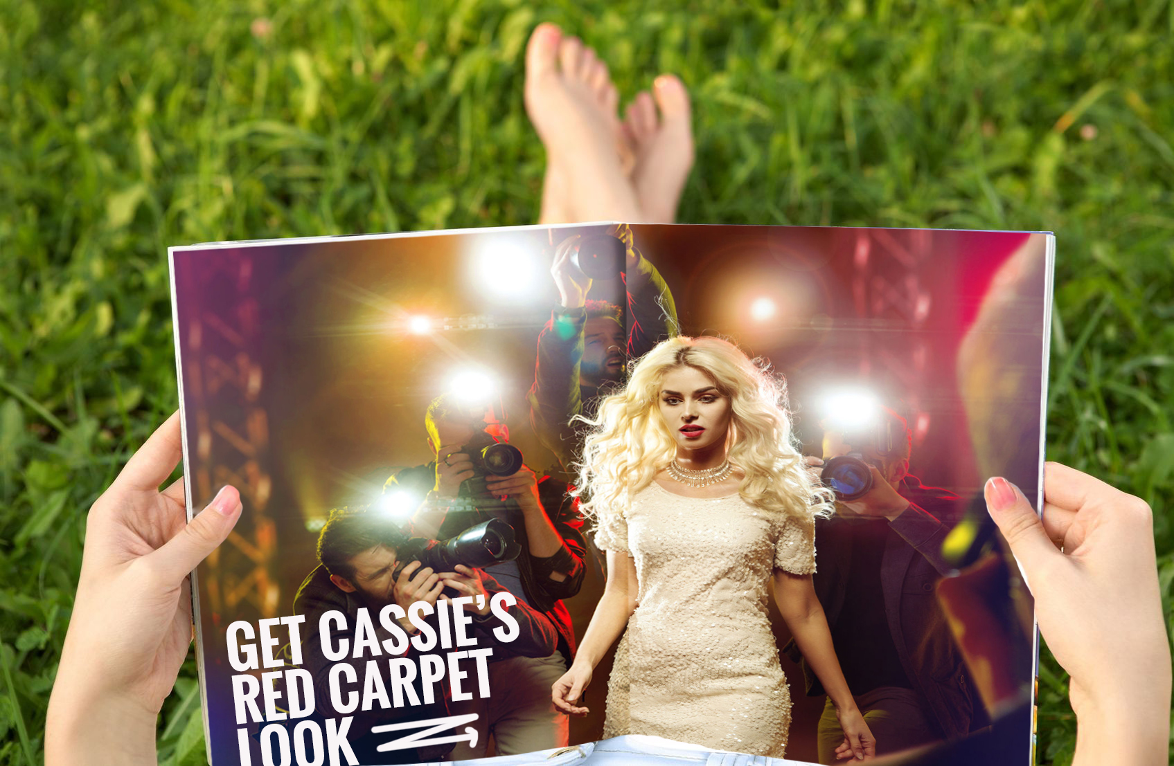
Before the term was adopted for web design, hero images were defined as large, prominent visuals in print media. They were full-page advertisements in newspapers, two-page spreads before the main article in magazines, or the larger-than-life sized posters in store windows.

Two-page magazine spread with hero image.
While they still remain prevalent in print, hero images in web design are full-width visuals found on homepages, blogs, and landing pages - used for slideshows, calls-to-action, and background imagery in lieu of whitespace.
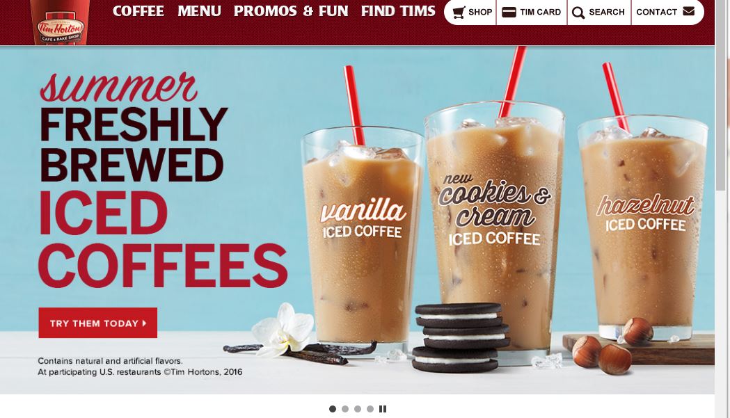
Found at the top of a web page (or sometimes as the entire page), hero images are located above the fold, so they’re front and center when a visitor comes to your site. In other words, they occupy ideal real estate for introducing your company’s brand. They’re also the perfect place to promote a product, service, person, or event that your business wants to highlight.

Image of Tim Horton’s homepage slideshow, highlighting their iced coffee beverages.
Hero images demand attention, which makes them the quintessential tool to grab your audience’s attention once they arrive to your website.
Why They Work
What is it that makes these images so hard to ignore? Besides their obvious size, it’s a proven fact that people are drawn to visuals over plain text.
Using a high-quality image of your best-selling product or a photo of a celebrity endorsement on your homepage is going to be much more striking than six paragraphs of plain text.
Imagery is captivating and communicates your message 60,000 times faster than text. When you have just seconds to make a first impression on your audience and encourage them to stay on your website, is there really any choice?
Visuals are timeless; therefore, it seems that hero images are as well. They’ve remained popular in the design world for more than a few years already - which is quite impressive in an ever-changing industry like web design.
And as technology becomes more capable of displaying larger images on devices of all sizes (without hindering site speed or load time) there seems to be no end in sight to the usefulness of hero images.
How They Work
Not only are visuals timeless - they’re immensely adaptable.
When designing your website, you want something that’s visually attractive but that also provides a positive experience for your users. With a hero image framework, you can keep the same layout on your website, but switch out the image or video content to adapt to your current marketing campaign.
It’s simple, yet effective. In fact, there are a handful of case studies that prove how timeless and effective image-focused web design can be.
One brand that utilizes the power of hero images is Southwest. It’s effective because the layout provides great user experience, and all they have to do is change the photo and text at the top to reflect their current marketing campaign or call-to-action.

Screenshots of Southwest’s website in 2014 and in 2016
Two years of using a similar layout seems preposterous with today’s transitional web design trends, but hero images make it possible. They just work.
Recap
Hero images demand attention. You can use them to visualize your branding, promote a new product, create slideshows or calls-to-action, and so much more.
Visuals will always have a place in web design, but how we design visuals is changing every day. Will hero images be able to withstand the continuously shifting trends in design, or will a new feature or layout take center stage?


Thanks for providing an overview of this clever twist to website image design, we will definitely consider this approach. Peace Chris Christina @EBusinessBuz
Thank you, Chris! We’re glad you found it helpful!
Best Regards,
Kathryn