The author of The Art of Personal Branding, Bernard Kelvin Clive, once said, “The world is fast changing and until you learn to adapt and adjust to stand out from the masses, you will fade into oblivion.”
In other words, consumers get bored.
Take, for example, the beloved story of Sherlock Holmes. How does the same story remain interesting after being told a million times over? Because each person who tells it does so a little (or a lot) differently. Offering a new spin on the same story keeps audiences from getting bored.
With consumers always looking for the next best thing, it can be difficult for your business to stand out from the masses. Yet, there are companies who are selling the same products today as they were in 1905. How do they do it? They understand that, even though their products may be just as prevalent and useful as they were over a hundred years ago, the way they market their products needs to constantly adapt to their ever-changing audience.
Let’s take a closer look at a few of today’s top brands that have remained consumer favorites over the years by consistently refreshing their brand identities (while staying true to themselves).
LEGO
Though it started as a 10-person company making wooden toys in Denmark, LEGO has certainly come a long way since 1939. Over the years, they’ve made the brick design more durable, patented their LEGO block design, exploded their international sales, and become the multi-billion dollar company we love today.
So, how has a company that sells tiny plastic building bricks remained so beloved over the years? They consistently evolve – in both their products and branding – all the while remaining true to their original brand mission: providing an outlet for a child’s imagination.
It was the owner’s son, Godtfred, who saw the immense potential in LEGO bricks to become a system for creative play. This mindset was essentially the birth of the brand, and by by 1954 the LEGO brick was trademarked.
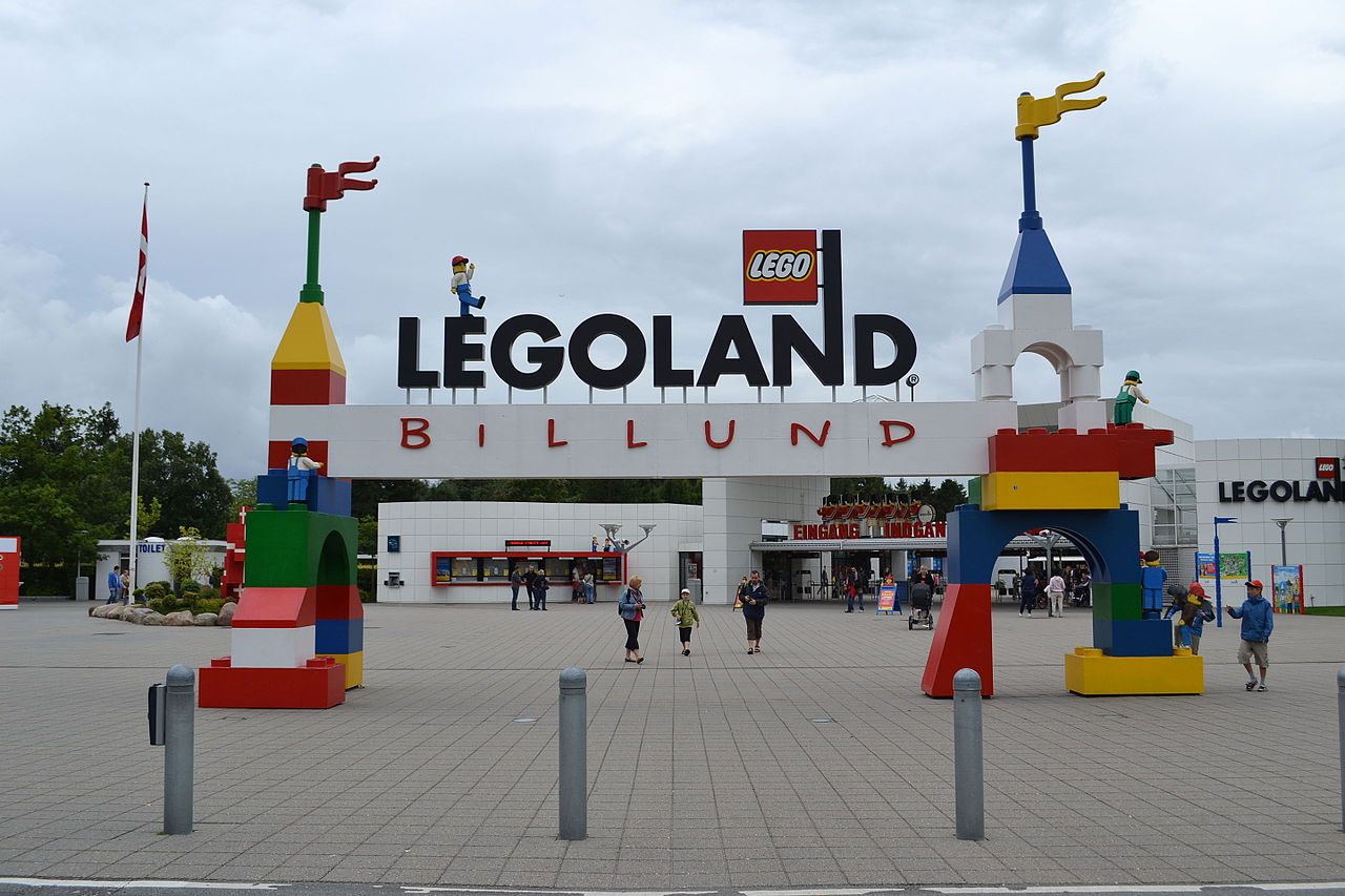
To market their new brand to the world, they opened the very first LEGOLAND resort in 1968 located in Denmark, attracting 625,000 visitors in its first season. The early success of this park seemed like a precursor to the wild success the company would experience through the years. Part of that success was due to the company’s ability to shift marketing efforts to fit their audiences.
Image via Wikipedia
Up until the turn of the 21st century, LEGO was marketing to children and parents (via LEGOLAND and children’s magazines) and basically ignoring their (always growing) adult fan base. Realizing this, they soon adapted some of the marketing for the new 5,000-piece LEGO model sets specifically to adults.
LEGO also had to adapt their products and marketing to new media, digital marketing trends, and changes to the market. For example, in 2005 they launched the LEGO Factory, a website where consumers could build custom models and purchase all the LEGO pieces they needed to create their designs (sorry, guys, it’s no longer active).
We also can’t leave out the 2014 LEGO Movie that revamped the world’s (both kids and adults) love for LEGO all over again while earning $400 million globally. The company also developed a very successful line of LEGO video games for Xbox, PlayStation, and Nintendo.
From plastic toys to Hollywood to video games, LEGO continuously adapts their brand to new media to ensure they are targeting every niche possible – all while ultimately remaining a system of creative play and an outlet of imagination.
Cadbury
It’s no secret that people love homemade recipes passed down from older generations. So it should come as no surprise that the food industry is home to many businesses that started with a single homemade recipe and grew into favorite consumer brands. Cadbury Chocolate is one of those success stories.
The grocery-store-turned-factory began almost 200 years ago when John Cadbury began manufacturing his own recipe for cocoa in 1831.
From that original cocoa recipe came countless variations and products over the years. For example, in 1875 the company created the very first Cadbury Easter Egg – which is still one of the world’s favorite Easter chocolates over 130 years later.
As their recipes evolved, so did their marketing – and therein lies the secret of their successful brand.
Around 1900, Cadbury started producing beautiful poster and magazine advertisements illustrated by a local artist. This was the start of the brand image that consumers worldwide are still in love with today.
As Cadbury grew, they knew their branding had to evolve to reflect the changes. Some of these changes included their first official logo and product/company expansions.
While Cadbury’s branding has remained purple since 1920, the logo changed several times over the years. A 1921 adaption featured a script font based on the signature of William Cadbury, and variations of this script are still featured on all Cadbury products today.
Today the modernized script logo is applied on products and branding tools alike, including their website, social media accounts, and other traditional print poster ads. With over 57 sub-brands under its confectionary category, it’s impressive how Cadbury manages to keep their brand consistent throughout all of their products and materials. And consistency is important because of how much this brand is defined by the trademark purple and whimsical logo script. These elements have given off a sense of trustworthiness, success, and comfort for many years now.
But all of that doesn’t mean that Cadbury’s marketing is stuck in the past. Pearlfisher, an advertising company Cadbury has partnered with, created the video below to represent how new design changes have allowed the company to modernize their marketing while also paying homage to the traditional brand.
And if all that wasn’t proof enough of their adaptability, there’s been some talk of plans to add a food service element to their brand as well in the form of a chocolate-themed café called the “Cadbury Cocoa House.” Clearly, their ability to evolve their products and marketing simultaneously (and consistently) is one of the secrets to their success.
Apple
Whether you’re a PC or a Mac user, there’s no denying that Apple is one of most successful brands of all time. Since its beginnings as a humble startup in a garage in 1976, Apple has (very) quickly evolved into the corporate giant we know today.
The secret weapon? Steve Jobs’ uncanny ability to understand his audience and adapt consistently strong marketing tactics for that audience.
The Apple I computer in 1976 was the company’s first product, and was accompanied by a manual with an illustrated logo to represent the new Apple Computer Company.
This Indian-ink drawing for the original logo was created by Ron Wayne, the third member of the small start-up company. At first, Jobs kept this version – even after Wayne sold his share of the company – which is understandable after reading the history of the logo. However, when the company began work on the Apple II computer, Jobs allegedly advocated that a more “stylish” logo would improve the company’s sales.
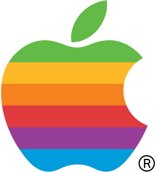
Image via Wikimedia
Thus the rainbow apple logo was born later that year in 1976. This new design ushered in a new era of Apple marketing.
Before 1984, Apple implemented standard advertising techniques, including print advertisements. These ads were full of text, and didn’t really set the company apart in any way. But their marketing efforts completely changed caliber with the logo redesign and the release of the 1984 commercial for the first Apple Macintosh computer. This ad – considered by many to be the greatest advertisement of all time – established Apple as a brand, cementing its place as a beloved household name.
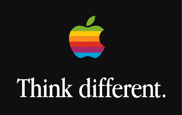
Apple took its brand to the next level again in the 1990s “Think Different” campaign, “which were more focused on brand image than specific products.”
Image via Wikipedia
By 1998, Apple modernized the iconic logo with a solid monochromatic version that has remained current to this day.
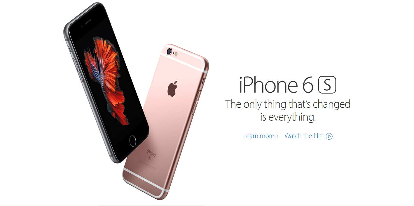
Although the logo hasn’t changed that much since 1998, the brand obviously has. From their early print ads to the famous 1984 Super Bowl commercial to their three-year-long Mac vs. PC campaign, Apple evolved into a brand that promises to create the next best thing to make consumer lives easier and better. Some of this evolution is obvious in the seven years of TV ads that Apple created to introduce each new update to their line of iPhones.
Apple is undeniably successful at rebranding themselves and their products. They are always evolving and adapting because “the only thing that’s changed is everything.”
Image via Apple
McDonald’s
McDonald’s got their start by selling 15-cent hamburgers in California, and today their cheap, tasty fast-food brand brings joy to adults and kids around the world. The golden arches are probably one the most easily recognizable logos in the world – but there is so much more to their brand.
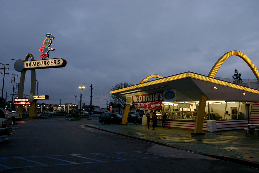
In 1948 the McDonald brothers revamped “McDonald’s” from a barbecue to a drive-in restaurant with a streamlined nine-item menu and new logo – featuring the mascot Speedee. But the illustrated chef was quickly replaced by the famous Golden Arches, established in 1952 by architect Stanley Clark Meston.
Those famous arches are what tied – and still tie – all the varying aspects of McDonald’s branding and marketing together. In 1954, not only were the arches used in a new version of the logo, but when Ray Kroc opened the first out-of-state location in Des Plaines, Illinois, the arches were incorporated into the new building design as well. Even today, some McDonald’s (like one on the Niagara Falls Blvd. near Mainstreethost’s headquarters) still have the golden arches protruding through their building.
Image via Wikipedia
These arches are now synonymous with the McDonald’s brand all over the world. All you have to see is the yellow “M” to know exactly which brand you’re dealing with. Even the phrase, “golden arches” has come to have its own cultural relevance. But there’s another image we associate with this chain as well.
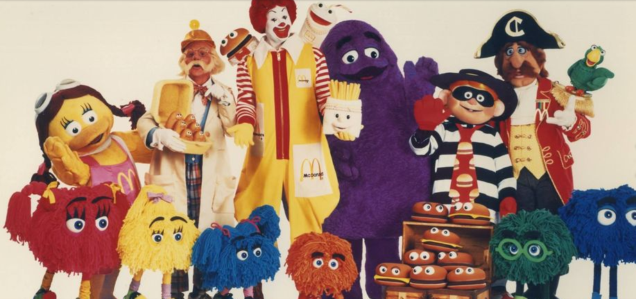
Ronald McDonald was introduced in 1966 as the new face of McDonald’s in their first national television commercial.
Though the golden arches still acted as McDonald’s logo, Ronald McDonald was an instant hit. And Ronald spurred major changes to the rest of McDonald’s branding. Even though they continued their efforts towards adults, they also started targeting their marketing directly to children. Within a few years, McDonald’s revamped their marketing efforts again with the addition of Ronald’s new friends – really expanding their brand to a fun, fast food favorite for the whole family.
Image via McDonalds Wiki
Since the 1970s, McDonald’s has undergone multiple rebrands – and many campaigns. Here is a brief overview of the multitude of faces McDonald’s has worn over the past six or seven decades:
Regardless of how you feel about the actual design choices, you can’t argue with the fact that McDonald’s really understands the need to consistently adapt to an audience that is endlessly growing and changing.
Recently, McDonald’s has recognized that consumers are becoming increasingly more health conscious and tech-savvy. Because of this, they made changes to their marketing, brand, and products that reflected their audience’s changing interests. In 1987, fresh salads were added to the menu, and today there are even more healthy options such as apple slices, Halo oranges, and more. And we can’t forget their transparency campaign of 2014 that filmed the process of how McDonald’s buys, cooks, and packages their menu items.
Their first step into the digital world was in 1996 when they launched their first website. Now, their digital brand consists of a main McDonald’s website and an app aimed for adult customers, plus a separate Happy Meal website and McPlay app intended to market directly their younger audience.
Like them or not, the result of McDonald’s consistent efforts to revamp their brand, products, advertisements, and even packaging is that they are one of the most successful examples of brand-building in the world.
Recap: Timeless Brands
With years of experience, talented marketing teams, and the ability to understand their audience, these timeless brands certainly know how to keep consumers from getting bored. They’re diligently aware of how their audiences are changing and will modify their brand to meet those changes.
Only time will tell if today’s newer brands like Netflix, Airbnb, and Dollar Shave Club learn a little something from these established brands.


