What is a Call-to-Action?
While some industry terms are not as literal, a call to action (CTA) is just as it sounds. It’s a call (request) for someone (in this case, website visitors) to take a specific action (do something).
When you get visitors to your website, there should be a clear route for them to take. You can guide them to different pages through your site’s navigation and even through text links, but calls-to-action take this further. Instead of leading people to look at various website pages, direct them to do more: download an eBook; call us for pricing; sign up for our newsletter; schedule a consultation today; subscribe to our blog and so on.
Why Should I Have CTAs on my Website?
Now that you know what a call to action is, it’s important to understand why you should incorporate them onto your website. From an inbound marketing mentality, CTAs are going to help you generate leads. The button should lead to a landing page with an offer, and a subsequent form for the visitor to fill out to receive said offer.
Calls-to-action also help break up the design of the website. Generally, bright, attractive and noticeable CTAs stand out from the rest of your website’s content and draw people in.
When designing your CTAs keep the following in mind:
- Use enticing copy; choose your words wisely, and keep it short and to the point
- Be clear in what your user gets when they click the button
- Use bright and bold colors; your call-to-action should stand out and make a statement
- Use light text color on darker backgrounds; use dark text on lighter backgrounds
- Size doesn’t matter; however your CTAs must be noticeable
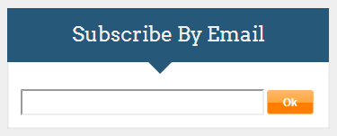
Here are a few examples of CTAs on our Mainstreethost website:


