If you haven’t noticed, we’ve been talking about user experience quite a bit lately. And by quite a bit, I mean all of our posts this month are about some aspect of user experience- but hey, it’s an important topic!
So instead of going into what UX is and why you should care (I already did that here), let’s jump into 13 overlooked elements of user experience.
In no particular order, here they are:
1. Mobile Solutions & Responsive Design
In this day and age, there’s no reason your website shouldn’t be mobile friendly. Mobile solutions and responsive designs allow your website’s users and visitors to move easily between devices, without sacrificing the design, layout and consumption of your site’s content. After all, we use the Internet for ease of information consumption; make it easy for visitors to do so, regardless of the device they’re using!
If the following stats don’t convince you why mobile is a must, I don’t know what will:
- 57% of users say they won’t recommend a business with a poorly designed mobile site. 40% have turned to a competitor’s site after a bad mobile experience. (Google’s Mobile Playbook)
- 61% of people have a better opinion of brands when they offer a good mobile experience. (Latitude)
- Close to 50% of worldwide Internet consumers are using mobile devices as their primary mechanism for surfing the Web. (MarTech)
2. Easy Navigation on EVERY Page
Here’s the thing: if I can’t navigate through your website with ease, I’m leaving. And I don’t think I stand alone with this sentiment.
Whether you have navigation along the top of your website or along the side, make sure it’s easy to find and easy to navigate through.
One exception to this is your landing pages. Since landing pages serve the purpose of presenting an offer and gathering contact information, you want people staying on that page, and that page only.
3. Social Buttons – Follow and Sharing Ones
Whether you realize it or not, social media is where people spend their time, engaging and interacting with various brands. It’s an additional outlet to learn more about a company and their culture, and to gain access to the content they share.
However, how do you expect people to find your social platforms if you don’t promote them on your website? Sure, they can search for your brand, or maybe even stumble across your profile, but wouldn’t it make more sense to provide them with access to your networks on your own website?
I think so.
Here’s my suggestion for helping enhance your user experience through social media: have social media follow and sharing buttons on your website. While the header or footer is a great place for follow buttons, make sure you include sharing buttons on product and blog pages. This little addition will help promote your content, while giving your users easier access to your social platforms.
Seems like a win-win to me!
4. Links from Your Social Networks to Your Website
I can’t tell you how many times I’ve come across a company on social media who didn’t link back to their website. Not only is it frustrating, it’s not smart business.
If you’ve taken the time to set up a profile, take a few more seconds to throw your website link into the About Us section.
5. Provide Contact Info and Contact Forms
You’d be surprised at how many websites fail to include their contact information on their website. Whether you provide a page in your navigation, a phone number in the header, or complete contact information in your site’s footer, make sure it’s there.
A significant part of user experience is providing your site’s visitors with access to the information they want and need. How can they contact you with a question? Where are you located? What are your store hours?
The nature of your business will dictate the contact information you include; however, you MUST make it easy for your users to find it!
Similar to providing your site’s users with easy-to-find contact information, provide contact forms on your website.
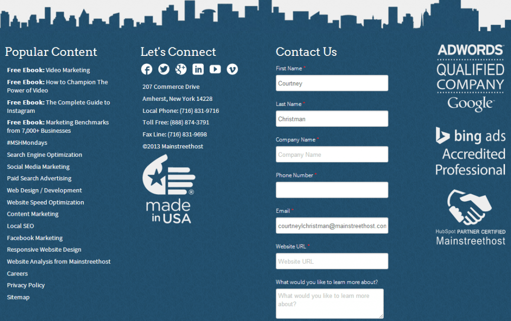
Here’s an example of Mainstreethost’s header and footer, complete with our contact information and a contact form:
Please note the importance of testing. Our contact form performs well in the footer of our site, but it may not be the case for other sites.
6. Accurate Meta Data
SEO may not have the direct impact it used to have on SERPs; however, it’s still an important element of the foundation of a website, being found on the search engines, and enticing people to click on a search result.
That said, complete and accurate meta data – including page titles and descriptions – is a simple, yet effective element that can help increase conversions and click-through rates from the search engines. Titles not only show up on your browser pages, but they’re also the titles you see in the search engines. Same goes with the page descriptions.
Do this:
Not this:
When composing each page title, keep them descriptive of what’s on the page. Don’t try to fool the search engines by stuffing several keywords and phrases onto one page; they will figure it out and they might even penalize you for it!
7. A Clear Message of What You’re Offering (Specifically on the Homepage)
If I land on your website, I want to know what you’re offering at a glance. I don’t want to have to work for it. I know, I know, I sound lazy, but I guarantee everyone who’s using the Internet feels the same exact way.
Your site’s homepage is prime real estate – take advantage of it!
Don’t make me guess what you do; use your homepage to illustrate what you’re offering and why I should choose you. This could be as simple as a clear headline, or as in-depth as a video.
8. Enticing and Effective Calls-to-action
CTAs are one of the easiest ways to get people to take the action you want them to. However, you must make sure they’re enticing, or else they won’t be very effective.
Like anything you’re doing on your website, figure out your users’ pain points and play on those. Are they looking for more information about a particular subject? If so, provide them with an ebook or offer based on that – and get them there using a CTA.
You might try something like this:
Or maybe you prefer something similar to this:
Create calls-to-action that make people take the next step.
“Submit” is not one of those. Be clever, be creative – have fun with these! Test out different versions so you know what works and what doesn’t.
9. The Right Amount of Content
Thankfully, gone are the days when keyword-stuffed content made you rank on the first page of Google. Now, whether you have 10 or 100 words on a page, you have the opportunity to be found online.
The key is QUALITY.
Make sure every word on your site serves a purpose. Don’t waste your breath composing long-winded, rambling copy that no one’s going to read.
Instead, focus on creating content that will impact your site’s users:
- Use bullets
- Break up your copy into sections
- Keep it to the point
- Think quality > quantity
Most importantly, keep your buyer persona in mind when creating content. What do they want to digest? How much information do they want on a given page? Are they readers or do they prefer to watch a video? These are all questions to answer while creating your website’s content.
10. A Blog and the RIGHT Blog Content
If your business isn’t blogging, it should be – here are five reasons why.
Beyond the many reasons blogging is something you should absolutely be doing (with a few exceptions), you must be creating the RIGHT blog content.
Create blog content your audience wants to consume. Answer FAQs, address industry news, provide how-tos and DIYs, and anything else your audience wants and needs to know. Whether you’re a B2B or B2C business, use your blog to add value to your user’s experience.
Here are some business blogging stats for your consumption via Quicksprout:
- 61% of US consumers have made a purchase based on a blog post
- 82% of your consumers enjoy reading relevant content from company blogs
- 60% of consumers feel positive about a corporate brand after reading their blog
- 70% of consumers learn about a company through their blog, rather than ads
11. Effective Headlines and Page Headers
Headlines – whether a blog post title, section header or page title – have the ability to draw the attention of your website visitors.
Keep them interesting. When creating headlines and page headers, ask yourself: would I want to read more? If your answer is no, it might be time to go back to the drawing board.
12. Take Advantage of Case Studies, Testimonials and Social Proof
Have you done some pretty awesome things for your clients? Have you helped them achieve amazing results? Or do they think your products and/or services are simply the best?
If any of this is the case, create case studies and ask for testimonials to feature on your website. This is an effective way to prove to potential clients what you’re capable of providing, in addition to providing social proof.
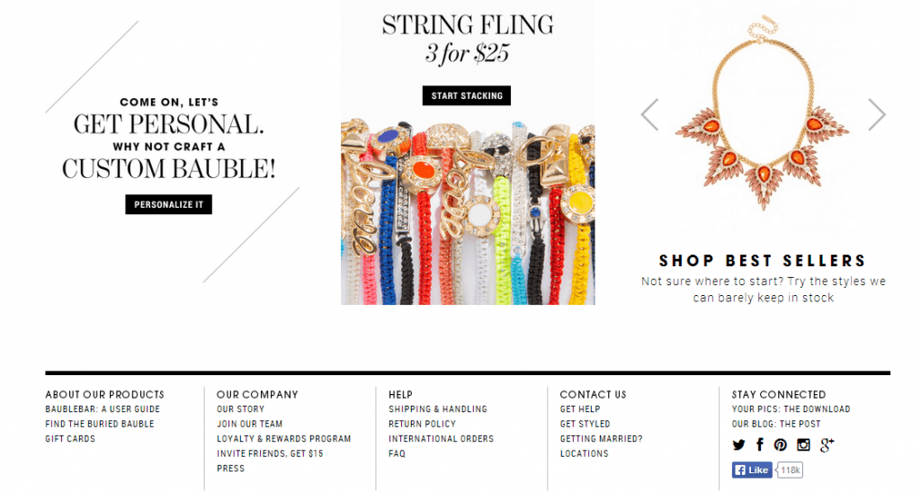
Taking the social proof a step further, promote the number of people who have “Liked” you on Facebook and other social networks.
On Bauble Bar, you can see that they have 118,000 fans on Facebook – pretty impressive if you ask me!
13. Videos
People are visual creatures: the more pictures and videos the better (depending on your audience and testing). This is no different for your website.
For some time, videos have been garnering a lot of attention on the Internet – hello, YouTube. Whether it’s a silly video, a product demo, or an about us video, people enjoy watching them, and if you’re lucky, sharing them.
Beyond entertainment value, videos are great ways to engage your site’s visitors. When it makes sense, have videos on your website. After all, many people prefer to watch a video compared to reading website copy.
Some things you’ll want to pay attention to provide great user experience include the length of the video, the placement of the video, and most importantly, the purpose of the video.
There you have it, folks: 13 overlooked elements of user experience.
Is there anything I missed? If so, let me know in the comments below!


