Social media platforms are always being updated, which means they’re frequently changing their profile and cover photo dimensions, layouts, and requirements for uploaded images. It can be tough to keep track of it all. We understand you’re busy; you can’t spend all your time sweeping the Internet for information that’s bound to change again tomorrow.
However, high-quality and creative imagery is imperative to social media marketing success, so it’s important to know the proper dimensions for each network you use.
Download our free eBook here to learn how to win over your audience on social media.
That’s why we decided to gather the information for you and keep it in one continuously updated place for your convenience. We also sprinkled in some social media image best practices. Pretty handy, huh?
We thought so, too.
Social Networks
For easy access to the information you’re looking for, click on one of the following to jump to that section:
- X (Twitter)
- X Pro (TweetDeck)
- Google Business Profile
- YouTube
- Snapchat
- Tumblr
Facebook Image Sizes
Featuring high-quality imagery on Facebook shows your audience that your business is legitimate, reputable, and pays attention to the details (no matter how small).
Facebook wants to provide a positive user experience on their platform—that’s why getting your image sizes just right will help your brand stand out and look its best in the Feed.
Facebook Profile and Cover Photo Dimensions
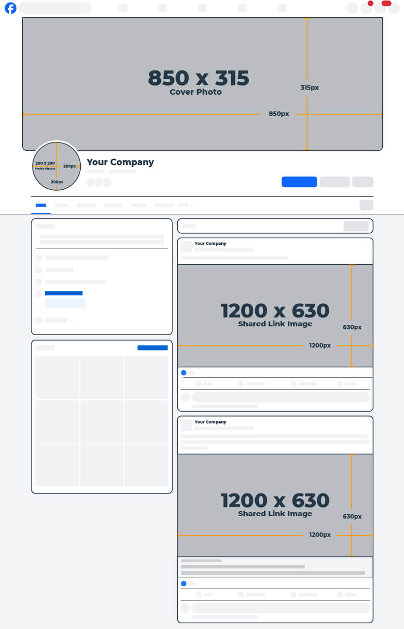
Most businesses use this space for their logo rather than a person’s photo. However, if your business is run by you and only you, using a photo of yourself might not be a bad idea. The best size for your Facebook profile photo is 200 x 200px—and remember, it’ll display as a circle on your page.
As for your cover photo, you’ll want to use this space to expand on your brand messaging or promote a new product, service, or event. What you decide to do with this space is vital to the success of your page because it will be the first thing a visitor sees when clicking through.
Facebook states that your cover photo will be left aligned with a 16:9 aspect ratio. Through our experience however, we found that your Facebook cover photo should be 850 x 315px (170:63 aspect ratio) to make the best first impression. Seriously, we tested it. This is the exact image size that doesn’t need adjusting after uploading to Facebook, which makes it easier to plan your design!
| Facebook Profile Picture | |||
| Recommended: 200 x 200 | Minimum: 180 x 180 | Aspect Ratio: 1:1 | Desktop Display: 168 x 168 |
| Facebook Cover Photo | |||
| Recommended: 850 x 315 | Minimum: 400 x 150 | Aspect Ratio: 170:63 | Desktop Display: 1250 x 463 |
Facebook Shared Image (Timeline & News Feed) Dimensions
These images appear both on your timeline and in most of your followers’ News Feeds. With the decline of Facebook’s organic reach, try asking your fans to like or share your photos to gain visibility without a significant financial investment. Or consider paying a small fee to boost your posts to ensure that your audience sees it in their Feed.
We found that a Facebook shared image size of 1200 x 630px works best!
| Facebook Shared Image | |||
| Recommended: 1200 x 630 | Minimum: 200 x 200 | Aspect Ratio: 40:21 | Desktop Display: 500 x 261 |
Facebook Shared Link Photo Dimensions
If you’re sharing a link to your business’ Facebook Page, there are a few more elements to consider and formats to choose from. When you paste a link into your status, depending on the size of the images on the web page, you’ll be prompted to include a carousel of up to 10 images. You also have the option of sharing the link without using the image—which can come in handy if you’d rather upload a new image to share with the link instead.
However, the most effective method to ensure your image is exactly right when sharing a URL, is by using the Open Graph meta-tag.
The recommended size for Facebook shared link images is 1200 x 630px, and that will get you the best display every time!
Pro Tip: Sharing images and links from other sources allows you to post relevant content to your page when you don’t have time to create your own. It’s also a great way to share content contributed by your audience or other businesses and keep promotions to a minimum.
| Facebook Shared Link Thumbnail | |||
| Recommended: 1200 x 630 | Minimum: 600 x 315 | Aspect Ratio: 40:21 | Desktop Display: 500 x 261 |
Facebook Stories
And right at the top of the newsfeed sits your Facebook Stories. These updates stick around for only 24 hours and won’t be shared to your timeline or the main news feed. You can create your stories on the fly, but wouldn’t it be so much easier if you had the image or video (accurately sized of course) ready to go live? We think so, too.
Over 500 million people regularly use stories, so to make sure yours always looks its best, your photo or video should be 1080 x 1920px.
All Facebook Image Dimensions
| Facebook Image Sizes | |||
| Profile Picture: Recommended: 200 x 200 Minimum: 180 x 180 Aspect Ratio: 1:1 Desktop Display: 168 x 168 |
Cover Photo Recommended: 850 x 315 Minimum: 400 x 150 Aspect Ratio: 170:63 Desktop Display: 1250 x 463 |
Shared Image Recommended: 1200 x 630 Minimum: 200 x 200 Aspect Ratio: 40:21 Desktop Display: 500 x 261 |
Shared Link Image: Recommended: 1200 x 630 Minimum: 600 x 315 Aspect Ratio: 40:21 Desktop Display: 500 x 261 |
Instagram Image Sizes
Instagram is all about visuals, which should make the importance of high-quality images blatantly obvious for this social network.
Instagram Profile Photo Size
As with some other platforms, the profile photo is a circle that shows up next to all of your posts and at the top left of your profile page. For businesses, it’s a great idea to use your logo here so all of your photos are associated with your brand.
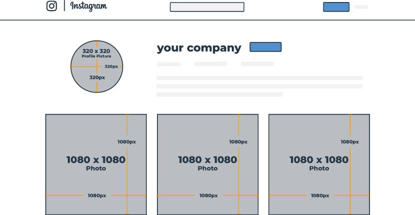
Instagram stores all profile photos at 320 x 320px, so we highly recommend uploading an image that size or larger!
| Instagram Profile Picture | |||
| Recommended: 320 x 320 | Minimum: 320 x 320 | Aspect Ratio: 1:1 | Mobile Display: 110 x 110 |
Now when you go to post on Instagram, you have a few more options available to you than in the past.
The recommended size for your Instagram photo is 1080 x 1080px. This size will ensure your post looks good in the Feed, as well as on your profile grid.
However, square photos are no longer the be-all end-all on this platform (though when you look at the grid view of your profile page, they will show as square). You have the ability to upload portrait- and landscape-oriented photos and videos, as well as a carousel of up to 20 photos per post.
And the platform only continues to become more flexible with its posts; though a 1.91:1 aspect ratio is recommended for landscape photos, Instagram will allow you to go as far as a 16:9 ratio if necessary.
Just remember, to keep images looking sharp across all devices with high-resolution displays, Instagram strives to upload your images at the best quality resolution it can (up to a 1080-pixel width). So, if you upload an image with a resolution lower than 320px, Instagram will enlarge it to 320px. Similarly, if your image has a resolution higher than 1080px, Instagram will size it down to 1080px.
Pro Tip: Instagram is a great place to show your company culture, what happens “behind the scenes” of your business, the process of creating your products, customers using your products, etc.
| Instagram Photo | |||
| Recommended: 1080 x 1080 | Minimum: 320 x 320 | Aspect Ratio: 1:1 | Desktop Display: 600 x 600 |
Instagram Stories
Instagram stories are an excellent way to engage with your audience, offering features like polls, interactive countdowns, and Q&As. The ideal image size for an Instagram story is 1080 x 1920px—these dimensions will ensure that your story takes up the whole screen providing a clean, aesthetically pleasing experience for your followers. Keep in mind, Instagram won’t resize story images, so the closest you can get to that size (or an aspect ratio of 9:16), the better.
All Instagram Image Dimensions
| Instagram Image Sizes | |||
| Profile Picture: Recommended: 320 x 320 Minimum: 320 x 320 Aspect Ratio: 1:1 Desktop Display: 110 x 110 |
Square Photo: Recommended: 1080 x 1080 Minimum: 320 x 320 Aspect Ratio: 1:1 Desktop Display: 600 x 600 |
Landscape Photo: Recommended: 1080 x 566 Minimum Width: 320 Aspect Ratio: 1.91:1 Desktop Display: 600 x 337 |
Portrait Photo: Recommended: 1080 x 1350 Minimum Width: 320 Aspect Ratio: 4:5 Desktop Display: 480 x 600 |
X (Twitter) Image Sizes
Known for its real-time social buzz, X (formerly known as Twitter) is also an extremely popular customer service and experience tool for businesses.
X (Twitter) Profile and Cover Photo Dimensions
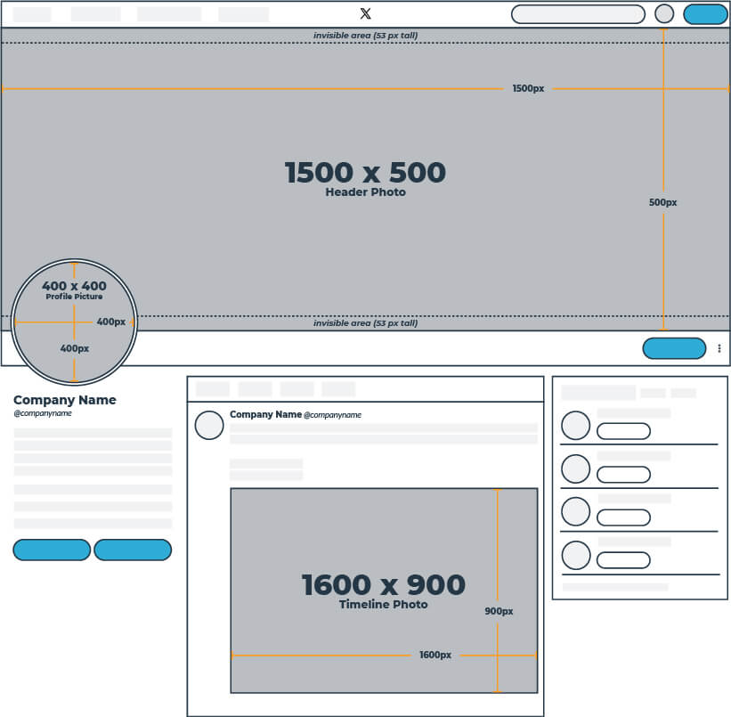
Your profile photo will be visible of course on your profile, in your timeline, as well as when your brand name is searched on X. Most businesses use their profile photo as a place for their logo because it is seen practically everywhere: when you Post, when others Repost your Post, when their Repost gets Reposted, and so on.
The recommended dimensions for your X profile photo are 400 x 400px.
| X (Twitter) Profile Photo | |||
| Recommended: 400 x 400 | Minimum: 200 x 200 | Aspect Ratio: 1:1 | Desktop Display: 134 x 134 |
Your cover photo, however, is only seen when a user clicks to your profile—but that doesn’t mean it’s not important! It’s a large photo across the top of your profile, so you want it to be high-quality and represent your brand.
It’s recommended that you upload your X cover photo at 1500 x 500 pixels, but because the cover photo is responsive, yours may end up looking larger or smaller depending on the size of your browser or screen.
To be safe, we suggest keeping all important content and design elements of your cover photo within the safe zone. 😊
And when you’re creating your cover photo, don’t forget to account for your profile photo in the bottom left corner!
Pro Tip: Cover photos are a great place to describe what your brand does, display a new product, or use as free advertising space.
| X (Twitter) Header Photo | |||
| Recommended: 1500 x 500 | Minimum: 1263 x 421 | Aspect Ratio: 3:1 | Desktop Display: 598 x 199 |
X (Twitter) Timeline Photo Size
While X has a limit of 280 characters (for now…), X Premium subscribers can post up to 25,000 characters. But don’t worry, you can always use visuals to assist in representing your brand and enhancing your shared content.
Attaching a photo to your Post used to take away 23 characters (because it needed the URL to link to the photo), but now, links and media attachments (e.g. photos, GIFs, videos, and polls) are no longer counted in the Post character limit.
And it’s a good thing too because Posts with images are over a third more likely to be Reposted than those with only text.
You can include up to four images per post. In-stream photos are displayed at 600 x 335px and can be clicked on to expand up to 1600 x 900px.
| X (Twitter) Timeline Photo | |||
| Recommended: 1600 x 900 | Minimum: 600 x 335 | Aspect Ratio: 16:9 | Desktop Display: 600 x 335 |
All X (Twitter) Image Dimensions
| X (Twitter) Image Sizes | ||
| Profile Photo: Recommended: 400 x 400 Minimum: 200 x 200 Aspect Ratio: 1:1 Desktop Display: 134 x 134 |
Header Photo Recommended: 1500 x 500 Minimum: 1263 x 421 Aspect Ratio: 3:1 Desktop Display: 598 x 199 |
Timeline Photo Recommended: 1600 x 900 Minimum: 600 x 335 Aspect Ratio: 16:9 Desktop Display: 600 x 335 |
X Pro (TweetDeck) Image Sizes
TweetDeck is now X Pro, which is included as a feature in the upper tiers of a (paid) X Premium account. To get access to X Pro, users must upgrade to either an X Premium account, which costs $84 annually, or an X Premium+ account, which costs $229 annually.
You still can’t make separate images for X (Twitter) and X Pro since X Pro is not a separate social network, so everything you post on one site will show up on the other (there’s no way around it).
However, you still want to take into consideration the way that your X images appear on X Pro because the dimensions do vary in size a bit.
Pro Tip: Some of your header image design will be covered by your profile photo and bio in X Pro. So if you have important text or imagery that you’d prefer be seen at all times, be careful about centering those elements.
PLEASE NOTE: Any images you upload to X will appear on X Pro, so you cannot have two different image sizes. However, be sure to keep the below dimensions in mind when creating X images to ensure that they render well across both platforms.
| X Pro (TweetDeck) Image Sizes | ||
| Profile Photo: Aspect Ratio: 1:1 Desktop Display: 73 x 73 |
Header Image: Aspect Ratio: 2:1 Desktop Display: 520 x 260 |
Timeline (In-Stream) Photo Narrow: 260 width Medium: 300 width Wide: 340 width |
Google Business Profile Image Sizes
Engage with your customers and keep a fresh presence on Google with eye-catching imagery that will help you stand out in both the search results and on Maps.
Google Business Profile Logo and Cover Photo Dimensions
Consistency is key with Google Business Profile (GBP), formerly Google My Business (GMB)—ensuring that your brand is easily recognizable right from the search results page.
With a strong GBP profile photo that represents your company (most commonly, it will be your logo!) and a cover photo to show some personality, you’ll make a great first impression when your business is searched for.
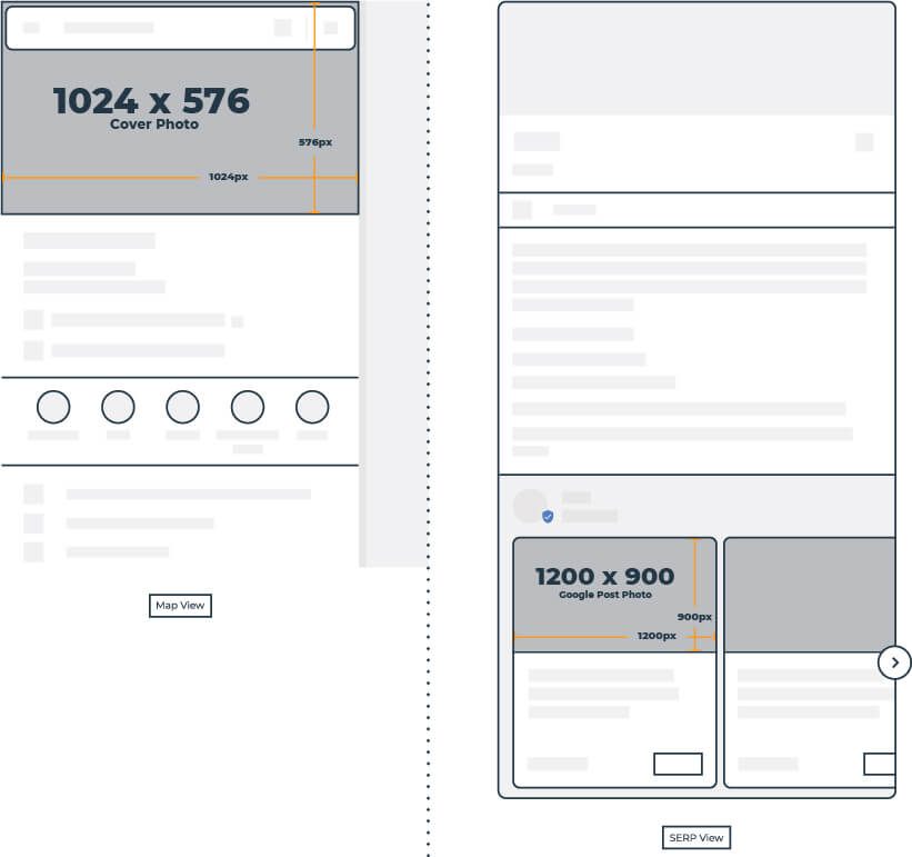
Google recommends that your GBP profile photo should be 720 x 720px and your GBP cover photo should be 1024 x 576px.
Pro Tip: Your cover photo is shown when a user is searching in Google Maps. Within your GBP account, you can choose what image you would prefer to display here, however keep in mind, it does not guarantee that it’ll be the first image to populate for your business.
Google Business Profile Posts Dimensions
GBP posts allow you to push events, updates, blog posts, offers and company news directly to the Google search results page. Posts offer a unique and visual way to attract the interest of people searching for your brand. These posts only stay active for a week, so be sure to update them frequently.
You can start posting from directly within the Google Business Profile interface. Be sure to use captivating images and attention-grabbing headlines to stand out. Your Google post size should be 1200 x 900px or an aspect ratio of 4:3.
All Google Business Profile Image Dimensions
| GBP Image Sizes | ||
| Profile Photo: Recommended: 720 x 720 Minimum: 250 x 250 Aspect Ratio: 1:1 |
Cover Photo: Recommended: 1024 x 576 Minimum: 480 x 270 |
Google Posts: Recommended: 1200 x 900 Minimum: 400 x 300 Aspect Ratio: 4:3 SERP Display: 230 x 130 Desktop Display: 404 x 303 |
Pinterest Image Sizes
Pinterest is a valuable search tool in itself; 80% of weekly users have discovered a new business, product or service on the platform, and 83% have made purchases based solely on a brand’s Pinterest content.
Pinterest Profile Photo Size
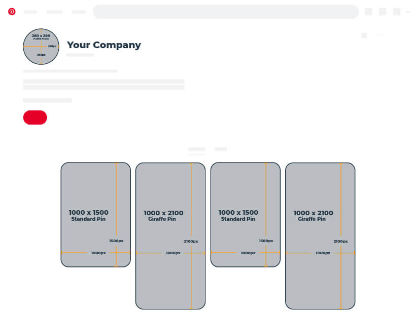
Your Pinterest profile photo should be 280 x 280px which makes it an easy aspect ratio of 1:1. Remember, your profile photo is uploaded as a square, but will display as a circle at the top of your profile.
For those with Pinterest business accounts, you also have the option of adding a cover photo to your profile! We recommend your Pinterest cover photo size be at least 800 x 450px with a 16:9 aspect ratio.
If you opt not to include a cover photo, that’s okay too! Your profile will look just the same as it always has, no empty spaces or missing images.
| Pinterest Profile Photo | |||
| Recommended: 280 x 280 | Minimum: 165 x 165 | Aspect Ratio: 1:1 | Desktop Display: 188 x 188 |
Pin Image Size
With Pinterest’s layout being more portrait-oriented, vertically designed pins tend to perform better. When deciding on size, create a pin that caters to what you want to visually represent; larger pins do not necessarily mean you’ll attract more attention.
We recommend a size of 1000 x 1500px for your standard Pinterest pins, and 1000 x 2100px for giraffe pins. For square pins, the recommended size is 1000 x 1000px. And if you’re posting a story on Pinterest, the recommended size is 1080 x 1920px.
If you’re creating a collections pin, you’ll want your hero image to have either a 1:1 or 2:3 aspect ratio, with the recommended sizes for each being 1000 x 1000px or 1000 x 1500px, respectively. To look best in the feed, each secondary image should have a 1:1 ratio.
| Pinterest Standard Pin | |||
| Recommended: 1000 x 1500 | Minimum: 600 width | Aspect Ratio: 2:3 | Desktop Display: 236 x auto |
| Pinterest Giraffe Pin | |||
| Recommended: 1000 x 2100 | Minimum: 564 x 1148 | Aspect Ratio: 1:2:1 | Desktop Display: 236 x auto |
Pinterest Board Display
The first thing you see when you visit someone’s Pinterest profile is their collection of boards. Name your boards appropriately and we recommend including a relevant, 222 x 150px cover photo for each of them. You don’t want empty boards (or no boards at all), but you don’t want a plethora of boards with no purpose, either.
Pro Tip: Ensure that your first two or three boards are directly related to your industry or audience. You don’t want visitors to leave your profile because they don’t understand what your business does or can’t quickly find the information they’re searching for.
Also, infographics tend to do really well on Pinterest.
All Pinterest Image Dimensions
| Pinterest Image Sizes | ||
| Profile Photo: Recommended: 280 x 280 Minimum: 165 x 165 Aspect Ratio: 1:1 Desktop Display: 188 x 188 |
Standard Pin: Recommended: 1000 x 1500 Minimum: 600 width Aspect Ratio: 2:3 Desktop Display: 236 x auto |
Giraffe Pin: Recommended: 1000 x 2100 Minimum: 564 x 1148 Aspect Ratio: 1:2:1 Desktop Display: 236 x auto |
LinkedIn Image Sizes
LinkedIn is primarily for networking with other professionals, but it’s also a resource for businesses to connect with other businesses, prospective employees, and industry leaders. You can choose between a personal profile and business page (both with free or paid options).
LinkedIn Personal Profile and Background Photo Size
You should have a respectable, professional photo of yourself for your personal LinkedIn profile. This way, you always know you’re making a good first impression with new connections! Your LinkedIn personal profile photo will look its best at 400 x 400px.
| LinkedIn Personal Profile Photo | |||
| Recommended: 400 x 400 | Minimum: 400 x 400 | Aspect Ratio: 1:1 | Desktop Display: 152 x 152 |
On LinkedIn, the background photo replaces the “cover photo” at the top of your profile page. As an oblong shape, it can be difficult to find imagery that fits the space well—that’s where creating your own visuals comes in handy. The recommended size for your LinkedIn background photo is 1584 x 396px.
| LinkedIn Personal Background Photo | |||
| Recommended: 1584 x 396 | Aspect Ratio: 4:1 | Desktop Display: 792 x 128 | |
LinkedIn Company Logo Size
The standard logo for a business account is a small square at the top of the profile page that is displayed next to your company’s name.
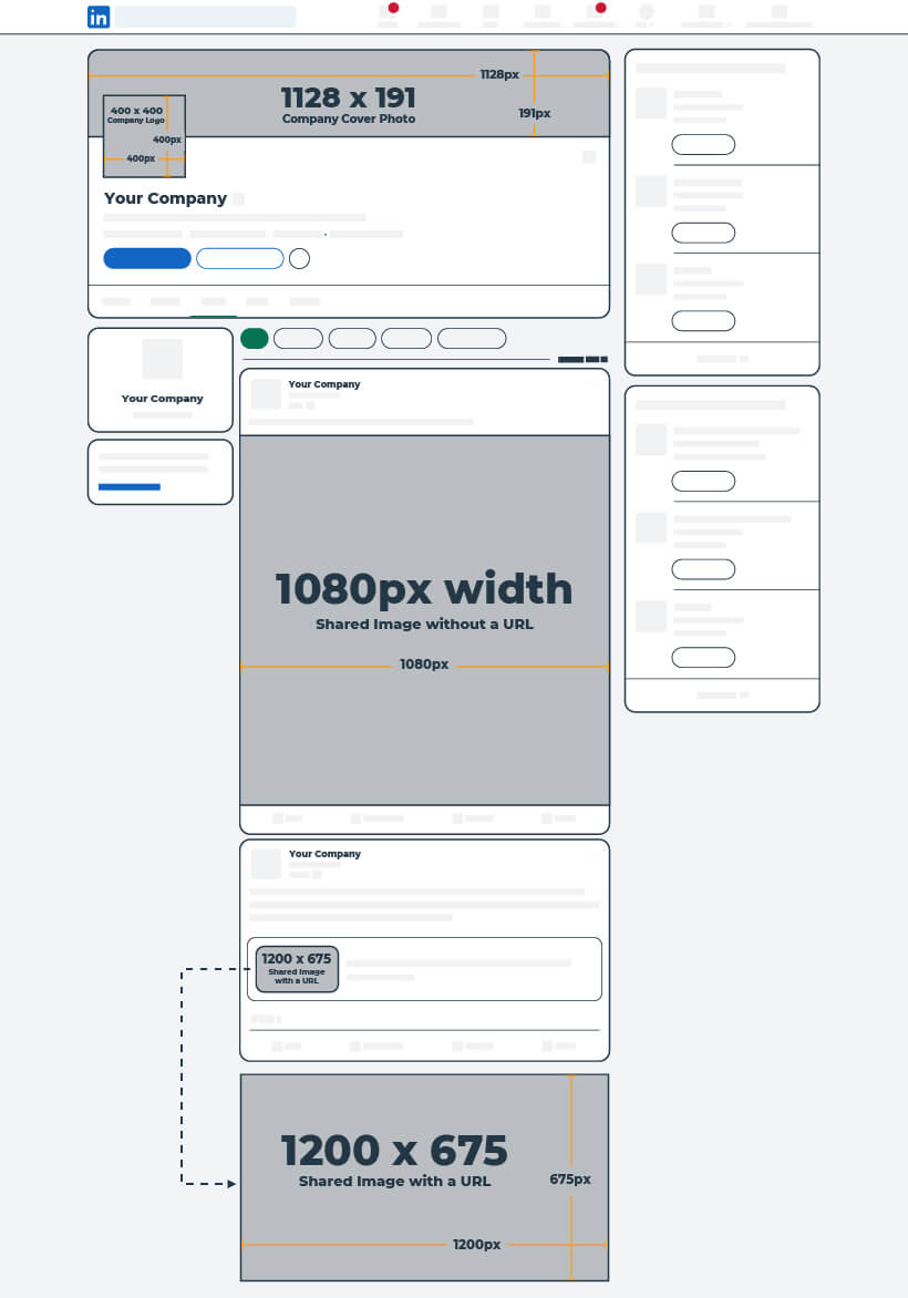
The square logo is what people see when they search for your company on LinkedIn, go to your profile, or see your posts in their news feed. Just like for your personal page, we suggest a LinkedIn company logo size of 400 x 400px.
| LinkedIn Company Logo | |||
| Recommended: 400 x 400 | Minimum: 268 x 268 | Aspect Ratio: 1:1 | Desktop Display: 128 x 128 |
LinkedIn Company Cover Photo Image Size
The cover image on a business page stretches across your profile above your logo and company name. The recommended size for your LInkedIn company cover image is 1128 x 191px.
Pro Tip: Use a photo of your employees or your business’ building as a banner photo—and avoid random stock photos. For background photos, it’s usually best to choose something subtle that doesn’t distract too much from the content on your profile.
| LinkedIn Company Cover Image | |||
| Recommended: 1128 x 191 | Minimum: 1128 x 191 | Aspect Ratio: 47:8 | Desktop Display: 1163 x 197 |
LinkedIn Timeline Image Sizes
Sharing images on LinkedIn is a great way to gain attention and spread brand awareness.
For single images shared, LinkedIn recommends photos have anywhere from a 3:1 to 4:5 aspect ratio, with a width of 1080px.
When it comes to sharing a link from your website, or any other third-party link however, the image will be pulled from the URL.
Now, that image used to post full-width with the link on your page, but LinkedIn made some changes in 2024—if you create an organic post with a third-party link, the image will show as a small thumbnail, displaying at a mere 128 x 72 px on desktop. But, if you create a Sponsored Content ad from your post, it will show as it used to as a full-width, eye-catching image that you can’t miss while scrolling.
This is LinkedIn trying to keep people on the platform as much as they can, but it has definitely made it a bit more difficult for businesses trying to share their own content from their websites.
For business accounts, you’ll also have access to a “Life” tab, which is a great space to show off your company culture and lifestyle. For sharing images in your Life tab, you’ll want your main image to be 1128 x 376px. For company photos, we recommend a size of 900 x 600px, and for custom module images, 502 x 282px works best.
All LinkedIn Image Dimensions
| LinkedIn Image Sizes | |||
| Company Logo: Recommended: 400 x 400 Minimum: 268 x 268 Aspect Ratio: 1:1 Desktop Display: 128 x 128 |
Company Cover Image: Recommended: 1128 x 191 Minimum: 1128 x 191 Aspect Ratio: 47:8 Desktop Display: 1163 x 197 |
Shared Image with URL: Recommended: 1200 x 675 Minimum: 360 x 640 Aspect Ratio: 3:2 or 16:9 Desktop Display: 128 x 72 |
Shared Image without URL: Recommended: 1080 width Minimum: 552 x 276 Aspect Ratio: 3:1 to 4:5 Desktop Display: 552 x auto |
YouTube Image Sizes
YouTube is a video-sharing social network that is accessed by users on the largest variety of devices, including tablets, phones, desktops, and televisions, so it’s important to have imagery that displays correctly across devices.
YouTube Channel Icon and Channel Art
A small profile photo overlays the top left corner of your YouTube page. As important as profile and cover photos are to representing your brand, on YouTube, many users will most likely see one of your videos before they view your channel page. This makes having striking images even more important so that users associate the videos with your brand and are familiar with you when they do reach your page.
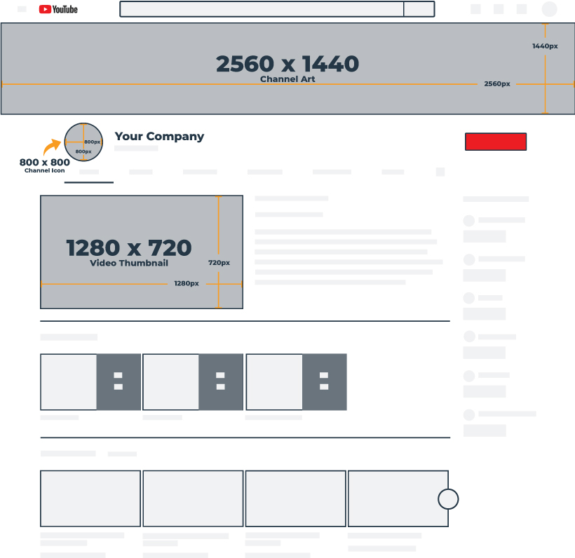
The recommended size for YouTube channel icons is 800 x 800px, and your channel art should be 2560 x 1440px.
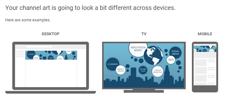
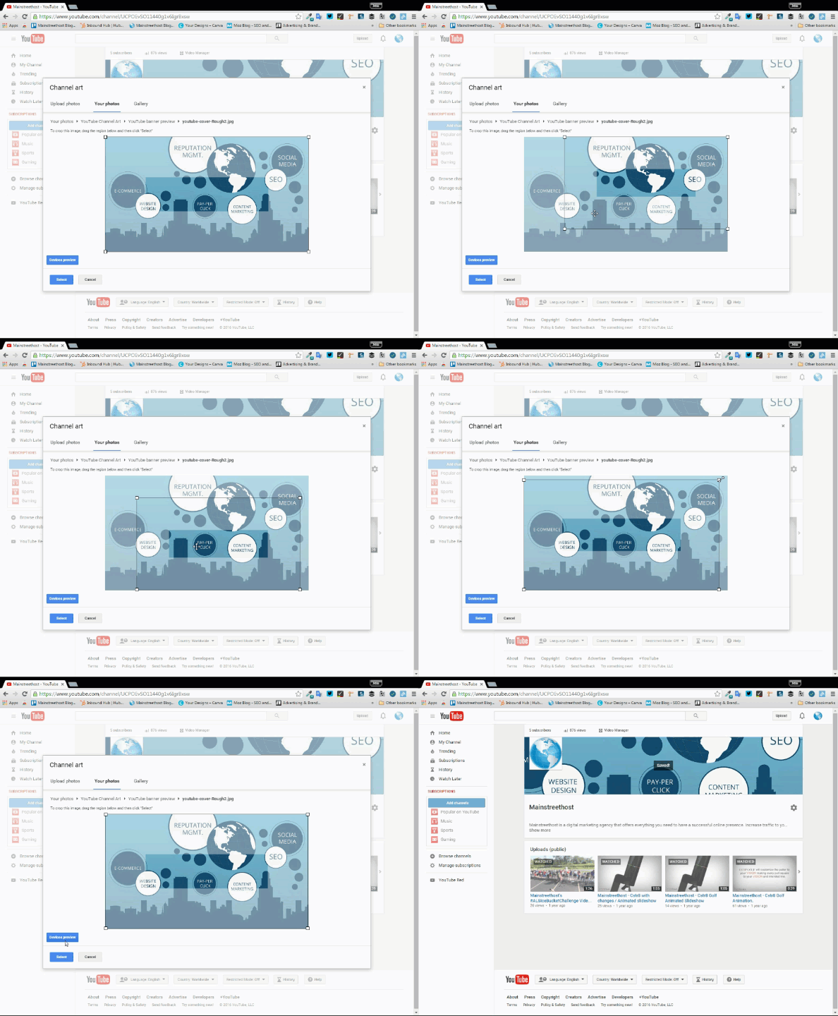
Pro Tip: You only upload one image for your YouTube channel art, but it will display differently across different devices. When you upload an image, you can crop it to fit the desktop layout (see the GIF below for a demonstration) – but make sure the important elements are right in the center to ensure they aren’t cropped out on smaller screens.
YouTube Video Uploads
Our recommended video upload size is 1280 x 720px, which is based off of a 720p HD display. For more information on other displays and sizes, check out this YouTube Help article!
All YouTube Image Dimensions
| YouTube Image Sizes | ||
| Channel Icon: Recommended: 800 x 800 Aspect Ratio: 1:1 Desktop Display: 98 x 98 |
Channel Art: Recommended: 2560 x 1440 Minimum: 2048 x 1152 Text Safe Area: 1235 x 338 Aspect Ratio: 16:9 Mobile Display: 1546 x 423 Tablet Display: 1855 x 423 Desktop Display: 2560 x 423 TV Display: 2560 x 1440 |
Video Upload Recommended: 1280 x 720 Minimum: 426 x 240 Aspect Ratio: 16:9 |
Snapchat Image Sizes
With over 443 million daily active users (and the average user opening the app more than 40 times a day), Snapchat provides businesses with a visual way to connect with their audience. Through the use of lenses, filters and ads, Snapchat is a source for engaging, unique content.
If you plan on running ads on Snapchat, keep in mind that the recommended size for Snapchat image and video ads is 1080 x 1920px.
And as of February 2023, Snapchat no longer supports Geofilter ads. Instead, users can create Sponsored Lenses or Story Ads.
Story Ads are a series of 1-10 vertical image or video ads that appear between content, or as a branded icon on Snapchat’s “Discover” section. Image Story Ads have a suggested resolution of 360 x 600px, and video Story Ads have a suggested resolution of 1080 x 1920 px.
Sponsored Lenses, on the other hand, offer an interactive AR (augmented reality) experience. While Lenses don’t have size requirements like Story Ads, they do have a few guidelines to follow. You can find out more about each option, system requirements, and how to get started here.
Below are the updated image sizes required to run successful Snapchat advertising campaigns.
All Snapchat Image Dimensions
| Snapchat Image Sizes | ||
| Snapchat Image Ad: Image Size: 1080 x 1920 Aspect Ratio: 9:16 Maximum File Size: 5 MB File Types: JPG or PNG |
Snapchat Video Ad: Resolution: 1080 x 1920 Aspect Ratio: 9:16 Maximum Ad Length: 180 seconds Maximum File Size: 1 GB File Types: MP4 or MOV & H.264 encoded |
Snapchat Story Ad: Image Size: 360 x 600 Aspect Ratio: 3:5 Maximum File Size: 2 MB File Type: PNG |
Tumblr Image Sizes
Tumblr is a blogging and social platform where users share thoughts, quotes, music, articles, GIFs, videos, images—basically anything. Images are (of course) an important aspect of this social network, but text-based content is associated with Tumblr as well.
Tumblr Avatar (Profile Photo)
Your Tumblr avatar will show up as a small square next to your posts in your followers’ main feeds and is embedded with your username in posts that users come across while perusing Tumblr.
The recommended size for Tumblr profile photos is 128 x 128px.
Tumblr Header Image
For profile headers, your photo should be 2048 x 1152 px. Headers and avatars can appear on both mobile and desktop. Mobile blog appearance will always contain a user’s avatar and header photo and is seen on the Tumblr mobile app, search pages in the app, profile previews, and via the web address www.tumblr.com/YourAccount.
You can customize your blog (including the option to display your header) using a custom theme. Your theme will be seen when people access your blog on a desktop or mobile web browser at YourAccount.tumblr.com. By default, custom themes don’t automatically transfer to mobile display. However, If your theme is responsive, you can turn off the “use default mobile theme” setting to display your custom theme on mobile.
Your avatar may also not be featured on your theme but will show up as your Tumblr’s favicon on browser tabs.
Tumblr Image Post
Now that your avatar is taken care of, it’s time to look to your posts. With eye-catching imagery, your post will have a greater chance of standing out and maybe even get some reblogs!
And it doesn’t just have to be one photo—choose up to 10 images to display per post when using the mobile app, or up to 30 images per post on desktop. Don’t worry, Tumblr made it super easy to create a photoset.
Just remember, the recommended size for shared image posts on Tumblr is 540 x 810px!
Pro Tip: Consider placing your business’ logo directly on the photos you upload to increase brand visibility and recognition.
All Tumblr Image Dimensions
| Tumblr Image Sizes | |
| Avatar: Recommended: 128 x 128 Minimum: 128 x 128 Aspect Ratio: 1:1 Desktop Display: 64 x 64 |
Shared Image Post: Recommended: 540 x 810 Maximum: 2048 x 3072 Aspect Ratio: 2:3 Desktop Display: 540 x 810 |


Short and sweet. I have applied all the dimensions mentioned. Great work!!!
This was very useful, thanks for putting this together. The instructions for keeping updated and editing the Google Doc seems straight forward. However, when I clicked on the link it doesn’t open up in my Google Doc, therefore, I am unable to set rules for notifications and editing like you suggested. Can you explain?
can i download this as .pdf ?? would be great….
DutchGlory We can likely send you a .pdf version of the graphic if that format works best for you. Let me know a good email address to send it to.
a pdf-download would be great
Rene, this is possible. Let me know a good email address to send it to and I’ll send it right over!
Rene, here’s a link to the .pdf for you https://www.mainstreethost.com/wp-content/uploads/2018/05/2018_social_media_sizes_infographic.pdf
Hope this helps!
Awesome! Thank you!
Hey, Craig.
Congrats on the awesome resource compilation, I’ll be checking back often and already bookmarked the Google Spreadsheet.
I’ll second the downloadable PDF idea, but whilst you don’t implement that I’d welcome your kindness in sending it to my pilfrota at gmail address.
Thanks in advance and keep up the great work!
@disqus_aR60pU96nz:disqus, here’s a link to the .pdf version for you https://www.mainstreethost.com/wp-content/uploads/2018/05/2018_social_media_sizes_infographic.pdf
Thanks for checking out this resource!
Much appreciated, Craig.
I was hoping for the source version, so we could use the vectorized shapes to make it easier to prototype/create the graphics, but this one will be extremely helpful too. Have fun!
Heard any more about the “new” Facebook cover? I had that look back in September but it only lasted a week or two. Curious if they’re rolling it out again.
Hi Louise!
Thanks for the comment.
While we haven’t received any definitive answers or heard any news regarding the “new” Facebook Pages cover and profile photo layout, we’ve updated this resource to note that a few Mainstreethost employees who were once able to see the “new” cover and profile photo layout are no longer able to. In an effort to get some answers, I reached out to a Facebook representative via Facebook for Business live chat support. She did some investigating and told me that it looked as though this was just a “testing feature.” We’ll continue to keep our eyes peeled and update this resource with any future news or changes!
P.S. I was actually really fond of the “tested” version! What did you think?
– Jess
Instagram posts now are 1080px base: https://colorlib.com/wp/size-of-the-instagram-picture/
Hi Fabio,
Thank you for the comment – right you are!
We’ve fixed the Instagram section of the post to include some additional information via Instagram. The infographic, PDF, and Google Sheet have been updated, as well.
– Jess
Do you have any design grids for Facebook Page event cover image? FB is claiming it should be 1920×1080 but the only place that seems to be working for is the event on mobile, at every other instance when it’s displayed (especially on desktop) FB crops the image horribly. I’d much appreciate any info you have. This is really starting to do my head in. Thanks for all the other great info though!
Hi Jules,
Thanks for the comment!
I found this resource from Sprout Social (updated on March 8, 2016) which seems to be pretty accurate: http://sproutsocial.com/insights/facebook-event-cover-photos/
I created a test Event Page and tried uploading one photo at 851 x 315, and one at Facebook’s recommended size of 1920 x 1080. Looking at the very rough comparison graphic attached to this comment, the “safe area” across desktop and mobile (for the actual Event Page) was right around the center (especially the area within the white rectangle, which remained 459 x 202 on each photo). So regardless of what size image you choose to upload, I’d make sure that the important information or visual is close to the center. Both images look nearly identical on desktop (since any image you choose will be fitted to 784 x 294 – although you do get the choice to drag and reposition the 1920 x 1080 photo, meaning that it does, unfortunately, get cropped – as you mentioned.
Oftentimes I’ll suggest using Canva’s (https://www.canva.com/) pre-sized templates to create social media photos / cover photos. Conveniently, they even have one for Facebook Event Covers (at 784 x 295).
I hope this helps!
– Jess
Awesome, Jess! Thank you. I had suspected that the solution might just be centring important content. I so appreciate your fast and detailed reply! Many thanks!
My pleasure, Jules!
Good luck – and happy Facebooking. ????
– Jess
Awesome, thank you! But I have a question for you regarding the Facebook Timeline Photo. I can see Facebook resizes the images at 470 px width in the desktop news feed… How come you recommend 1200x630px images? Where does Facebook displays the timeline photo at 504 px width? Thank you very much!
Hi Valeria,
Thanks for the comment!
You are correct; Facebook displays images in your timeline and in the News Feed at 470 px wide. If I’m not mistaken, they were once being displayed at 504 px wide on Facebook Business Pages, but I remeasured today and that doesn’t seem to be the case any longer (they’re measuring in at 470 px wide). However, I tried measuring images on my personal timeline and I’m seeing 487 px wide (486 px wide for timeline link images). We’ll look into this more and update the infographic / Google Sheet as soon as possible. ????
As for the recommendation of 1200 x 630 px, according to Facebook:
“Use images that are at least 1200 x 630 pixels for the best display on high resolution devices. At the minimum, you should use images that are 600 x 315 pixels to display link page posts with larger images. Images can be up to 8MB in size.” (Source: https://developers.facebook.com/docs/sharing/best-practices)
However, this specific suggested measurement is aimed at creating the large, rectangular-sized image like the ones displayed with links. Depending on what kind of image you’d like to share (for example, a square image from Instagram or a large quote graphic), you can truthfully use any dimensions you’d like, preferably with a width of at least 600 px (Canva suggests designing a regular Facebook post at 940 px by 788 px, which would scale down to 470 px by 394 px).
I apologize for the long comment – with all the updates and different sizes, it can get pretty confusing. But I do hope this helps answer your question!
– Jess
Hey, is it correct that the recommend format for timeline-posts is now 1230 x 630? Before, it was 1200 x 630, which sense makes this slightly difference?
Thanks for an answer!
Hi Christian!
Thanks for reaching out! The Facebook measurement is a little tricky because as you’ll see in earlier comments, the image display size varies a little bit between your news feed and your timeline. So technically, you would want to upload slightly different image sizes for each. Since you can’t do that, just stick with the original recommended dimensions of 1200×630 and the image should display well in both places. Thank you for bringing up a great point, and we’ve made the change to our infographic! Hope this helps!
Thanks a lot for all the content that you provided both in the infographic and in the e-book! It was very informative and gave me a fresh perspective on how to go about creating content for clients. Keep up the great work and thanks again for the direct, simple and friendly info!
Hi Matthew,
So happy to hear that the cheat sheet and ebook have been helpful in your social media efforts! Thank you for taking the time to check out our content – it’s much appreciated. Have a great day!
-Kim
Hi, does anyone know what the best settings are for creating video for new vertical Facebook videos? I read it works 2:3 ratio, but then opens full when selected. I therefore used a 1080×1920 ratio, but when selected the top and bottom are cropped quite heavily. Resolution is poor too, but guess that’s a Facebook thing?
Hi Steven!
I did some searching and you are correct – the 2:3 ratio is what Facebook recommends to accommodate the new vertical videos. So in that case, you would want a 1280 x 1920 ratio. Here’s a link to more dimensions and information directly from Facebook’s Ads Guide: https://www.facebook.com/business/ads-guide/video-views?toggle0=No
Hope this helps – and thanks for checking out our cheat sheet!
-Kim
Worked a treat – thank you! Great work on the cheat sheet, fab that it;’s kept up to date in this ever changing world 🙂
It definitely keeps us on our toes, but it’s well worth it! So glad you’re finding it helpful!
short and perfect size of all social media accounts. Thank you for putting together.
maybe this is obvious – but at what DPI/resolution – still 72? or 300? or 1080?
Thank you!
Hi Kara, The correct resolution 72 dpi.
Good place to go for template specs for the top social media sites. Awesome!
Really very useful your service !
Thanks For shearing those template.
Hello,
Has the Facebook cheat sheet been updated for the new UI that was released earlier this year?
Hey Michael,
There are some unconfirmed changes to the image dimensions within the redesign, but the switch to the “New Facebook” hasn’t been made for all users yet. We’ll be updating our info as soon as the new changes are fully rolled out!
Amazing! Thank you for sharing this template. I will use this as a guide on my SMM Course. 🙂