Think about the websites that you visit frequently, the ones you spend time digging around and visiting multiple pages. What sets those sites apart from the rest? Does it have anything to do with the design? How about calls-to-action prompting you to do something? Is the content easy to read and informative?
While I could go on and on asking questions about your website to determine some of the reasons your visitors may be bouncing off after visiting just one page, I won’t. Instead, I will provide you with three super easy ways to decrease your website’s bounce rate:
Design an Easy to Navigate Website
Have you ever visited a website that was difficult to navigate? A website that makes you work to find what you’re looking for? These are the most infuriating websites, and I hardly ever spend my time searching for a particular page, I will leave the website and find another one that will provide me with the info I seek.
To avoid frustrating your site’s visitors, make sure your site is easily navigated. While some websites will have main and side navigation, I recommend incorporating one or the other into your site’s design. Making it simple for your visitors to find the page(s) they are looking for will keep them on the site longer, and by keeping your visitors on the site longer and going through multiple pages, you will ultimately have a higher conversion rate.
Utilize Calls-to-Action
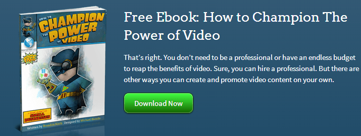
A call-to-action (CTA) is text or an image that encourages your visitors to take action. CTAs are useful in keeping visitors on your website by prompting them to do something(take action), such as downloading an E-book, filling out a contact form for more information about a particular service, buying a product or subscribing to a newsletter.
Not only do CTAs keep your visitors going through multiple pages, they are also functional in converting visitors into customers. Whether you decide to create images that link your landing pages to a contact form, or you simply have text urging your visitors to contact you for more information, calls-to-action are effective in decreasing your site’s bounce rate.
Create Enticing and Easy to Read Content
Creating enticing, informative and easy to read content is the third way to help decrease your site’s bounce rate. Tell your visitors the important information in a concise manner.
Gone are the days when keyword stuffing your content was a beneficial way to rank on the search engines, and thank goodness for that. Long, repetitive website content is just plain obnoxious. Nobody – and I mean not one person – wants to read long, drawn out content. Not only is this type of content irrelevant, but it doesn’t enhance user experience. In fact, it turns people off, if they even take the time to read it.
Whether you use paragraphed writing, bullets to draw attention to key information, or a mix of the two, your website’s content does not need to be 500 words. In fact, I would recommend keeping it short and to the point. Unless you have a lot of explaining to do about a specific topic, shoot for 100 to 200 words per page. This will keep your visitors engaged and more likely to visit other pages.
What are some other super easy ways to lower your website’s bounce rate? Let us know in the comments below.


