Your marketing department has spent countless hours putting together an eBook to share with website visitors, social media followers, and most importantly, customers. They’ve meticulously edited and reorganized content so it looks just right. Now all you need to do is get the word out that this content is ready for the world to see.
So how do you do that? Email marketing and social media campaigns are a great way to generate initial interest, but landing pages are where you can take these visitors and hopefully turn them into clients. After all, your goal isn’t just to bring a crowd to your website, you want to convert them!
What is a landing page?
Landing pages are webpages with the purpose of getting visitors to complete a particular action, oftentimes with the intention of providing some “offer” at the end. Generally speaking, visitors fill out a simple form before gaining access to a piece of content (if offered), and the company receives their contact information for future marketing efforts. Most commonly, an offer is for free, original content like eBooks, checklists, guides, etc.
What’s next?
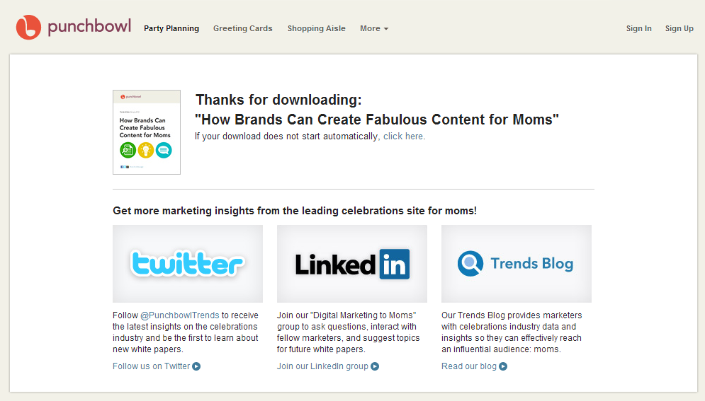
Once you’ve successfully gotten the visitor to fill out the landing page form, you should direct them to a “thank you” page, where they can access the content requested and be directed back to your website or social media accounts through links and buttons. While a thank you page isn’t necessarily required, it’s considered a best practice to provide requested content promptly and generate rapport with the lead in this way.
I like the below example because it has a simplistic layout, but provides a lot of information. You can not only download the content immediately, but you can also access the entire website through the top navigation bar and connect with the company on social media. If you choose not to include a navigation bar, social media is a great way to continue engaging the lead. This strategy makes it not so sales-focused, but rather emphasizes education and relationship-building.
What should every landing page include?
While there are a variety of strategies when it comes to using landing pages, there are a few elements that every page should have. Most importantly, there must be a call-to-action (CTA). A CTA is the bread and butter of a landing page; without a CTA, there really isn’t much value. This is where you have the potential to convert website visitors, so be sure to spend plenty of time developing the best CTA and offer possible.
It’s also important to have a target market in mind when it comes to the content being shared, as well as the look and feel of the page. It’s always necessary to know your audience and what types of content they would find most appealing. You should do this analysis not only at the website level, but for each specific landing page. This will maximize your conversion rate and minimize bounce rate (visitors who leave after only viewing one page) on your website. A landing page can’t be effective if people leave before filling out your form!
Finally, focus on one product or service to market per landing page; give it only one goal. Bombarding your audience with an assortment of products or offers is not only overwhelming, but it can be a turnoff. It can also cause visitors to forget the reason they were directed to the landing page in the first place. Keep it simple and create a unique landing page for each offer.
Important elements to consider for your landing page
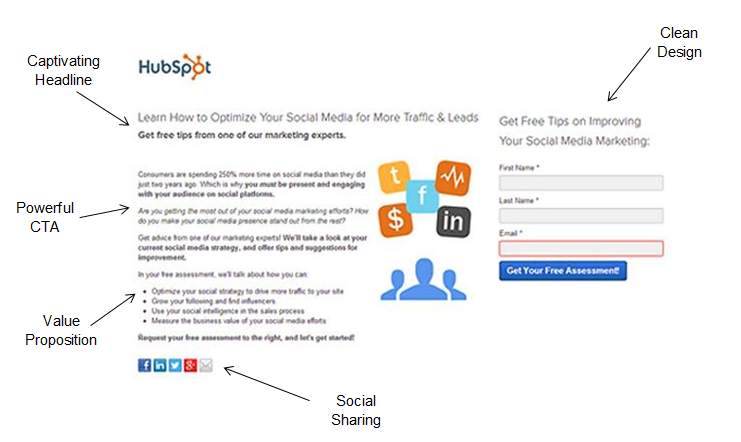
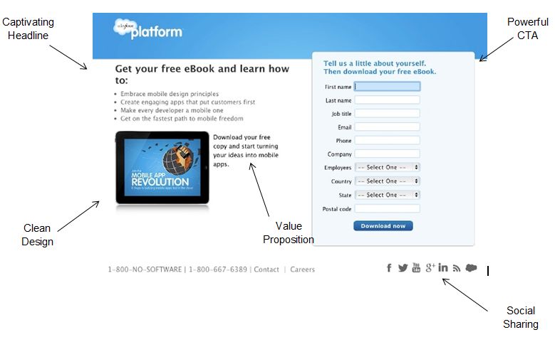
Captivating Headline
- The headline is what makes people continue reading, so make it count!
- Make it clear what you’re offering
- Keep it short and sweet
- Consider using a sub-headline to provide more information and be persuasive
Powerful CTA
- This is the action you want visitors to complete
- Write copy that generates emotions and makes people recognize a need
- Only include vital information that people need to understand your offer. Too much text will deter them.
- Include a “Click Here”-type of button to indicate where the offer is located
- Use contrasting colors and fonts to make it easy to find
Value Proposition
- Why should people fill out this form, download this eBook, etc.?
- Benefits of reading this content, its purpose, and what you will learn
- Include testimonials and quotes from customers to build trust
Clean Design
- Balance white space and content appropriately. Overly text-heavy or bare landing pages won’t be given full attention.
- Use images and/or video to keep the visitor’s attention and show what you are promoting
- Use bullet points or an outline format so the page is easy to read quickly
- A navigation bar is not always necessary. One link back to the homepage is oftentimes sufficient, but test out both options to see what works best for you.
- Forms should be relatively short so people aren’t deterred from filling them out
Social Sharing
- Include social sharing buttons at the bottom of your landing page
- Adds credibility to the offer and your company
Once you have all of these elements in place, it’s time to test. I would recommend doing A/B testing to try different layouts, color schemes, etc. to see what attracts the most visitors and form completions. Different formats may work for different offers, so don’t rush the testing process to see what maximizes conversions.
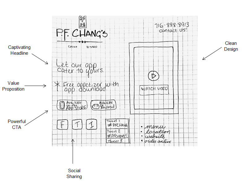
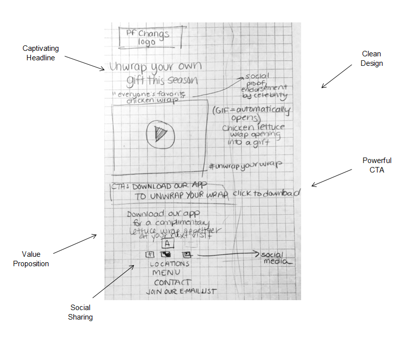
Our inbound marketing team recently visited a Canisius College marketing class and talked about the effectiveness of landing pages. As part of the class, we broke the students up into groups to design their own landing pages based on the best practices we had discussed. Pretty impressive results considering these were hand-drawn on graph paper and they only had 20 minutes to design! Below are a couple of our favorites alongside some other examples:
Landing pages are a critical part of your website’s overall success, providing great promise of converting visitors into leads and hopefully into customers. They are a great way to share original content and show expertise in your industry, while providing free advice or help to potential clients.
For more information about creating quality landing pages, check out this video!

