From time to time, you can actually judge a book by its cover. And when it comes to websites, you can almost always judge them by their covers.
Your site’s overall aesthetic can make a world of difference to each individual user’s resulting experience. Despite how many calls-to-action, banners and contact forms you have, visitors will rarely bother to invest their time if those cleverly engineered facets don’t look good.
But which design elements can truly affect how a user interacts with a website, and what can be done to improve their experience? Let’s take a closer look.
Size
Yes, yes… size matters. A call-to-action that’s in 10 point font won’t resonate like the same verbiage does in 100 point font. Here’s the difference:
Boil down your most important message(s) and light those suckers up for all to see. If you’re second guessing my advice, there’s a great deal of research to back this fundamental point up. In an eye tracking study conducted by Google and IBM, subjects were found to spend 34% more time on large fonts than small fonts.
It’ll generally be in your best interest to follow a hierarchical order of textual sizing – that is, sticking your strongest, most accessible headlines and calls-to-action to the largest font, and working your way down to a small size for the more in-depth reading.
And size applies to far more than just your verbiage. Consider what you’re trying to accomplish on any given page and scale your forms, fields, images, and navigation to accommodate those goals. A page that’s meant to pull in first-time visitors should likely air on the side of large, compelling visuals that catch the eye and sizeable (but sparse) text. In turn, as they navigate deeper to the meat and potatoes, they’ll have the patience and qualified interest to indulge in longer swathes of smaller text, images and the like.
Color
When it comes to color, it’s smart to stick to a consistent palette. If you have a pre-existing logo, basing your site’s color palette on it will perpetuate your brand’s look and feel.
Designing with a specific color palette in mind will convey both a visually-sound and professional appeal to your viewers. When every page on your site presents a similar color scheme and uniform design elements, visitors can rest assured they’re in the right place.
Of course, different colors can have different psychological effects on viewers. Consider your brand’s personality and how you want your target audience to react when they visit; should they become excited, mellowed out, heated, curious, grave or humored? Construct an ambiance that reflects their best interests and wrangles their attention.
Keep in mind certain color combinations are hard on the eyes, and others carry unavoidable connotations. For example, avoid red with green, black with orange, and – for the love of God – green on yellow unless you’re purposefully aiming for a holiday theme.
Layout
The way you arrange your site’s content is just as important to user experience as the content itself.
Where does your navigation go: the top, the side, the bottom, the corner, or perhaps smack dab in the middle? Will a consistent header and/or footer house said navigation and provide contact information or special announcements? Does it make sense to settle one way or another based on your site’s purpose and the content you’re providing your users?
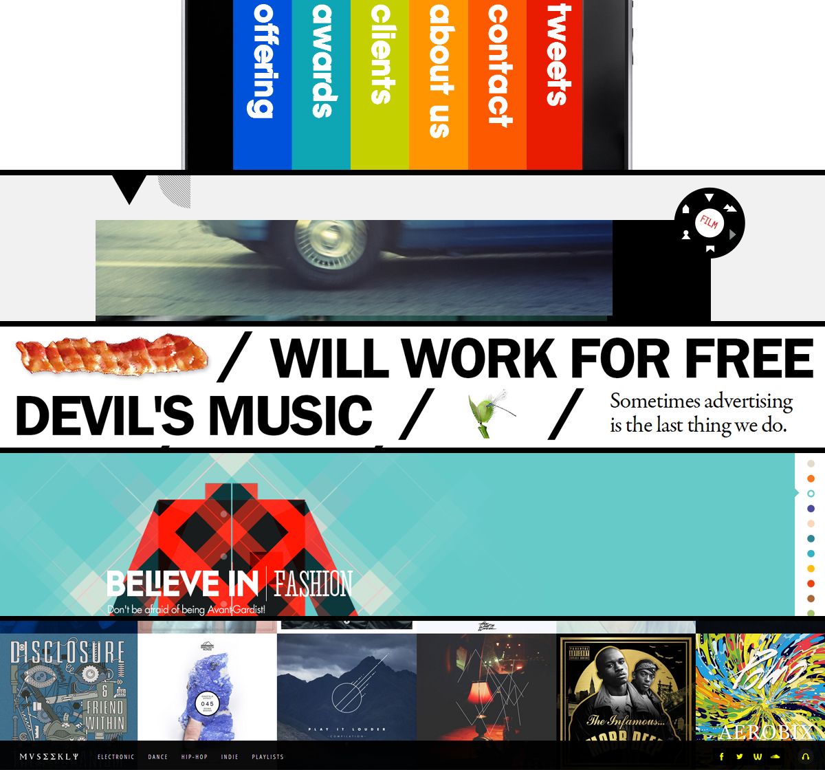
Here’s a preview of several very creative (and good-looking) site navigation schemes – peek at the links in the last paragraph to see each site in full.
Once you’ve laid the foundation, it’s time to place the rest of your content. Here are some general pointers to keep in mind regarding layout, regardless of your industry and individual goals:
- Create allure above the fold to captivate your visitors’ attention immediately. What’s the most compelling information that will capture and keep new eyes on your page? Arrange it front-and-center for the best user experience.
- Integrate relevant visuals with your textual content, and use these visuals to point visitors in the right direction. Photos, illustrations, videos, animations, and statistical graphics will send your message effectively and prompt further interaction.
- Give yourself room to expand. Sites grow as people and businesses grow, so build your site’s layout in a way that won’t limit your options for said expansion.
The next two categories are significant elements of layout, but are broad enough to break into their own categories as well.
Spacing
When it comes to user experience, the last thing on your mind may be the manner in which your content is spaced. Some would scoff at the mere mention of something as knit-picky as spacing, but it can make or break your user experience in certain cases.
Just ask yourself… if my writing was spacedlike so ,would you havebothered to have read thisfar into my post?
I didn’t think so.
We all know what a neglected webpage looks like: early-2000s era scrolling banners and clip art images squashed together with seemingly extraneous text. It’s this type of flawed design that speaks volumes to the importance of spacing – whether it’s between images, paragraphs of text or even the kerning between individual letters.
Allow enough space for your text and images to breathe, giving viewers an experience that’s organized and easier on the eyes. Make sure you’re using text wrapping when appropriate, and double check for overlapping content if you’re pursuing a custom design. At the same time, avoid creating gaping areas of negative space that allude to missing content.
Consistently botched spacing looks nothing short of sloppy to your visitors. And once they’ve questioned the legitimacy of your site and/or business, they’re far more likely to spend their valuable time elsewhere.
Flow
A web page is defined by its content, and characterized by its flow.
We’re so used to navigating the same website layouts in the exact same way. But what happens when you break out of the norm and give today’s digital denizen a genuinely creative way to browse your site? The manner in which your content flows has potential to provide your users with a delightful and memorable experience.
Will they scroll from left to right, or top to bottom? Or will they travel inwards through a more interactive experience that deviates the norm?
And how about the flow of the content itself? It’s easy enough to paste together chunks of information as they come and arrange a page like so, but the haphazard way is not the best way.
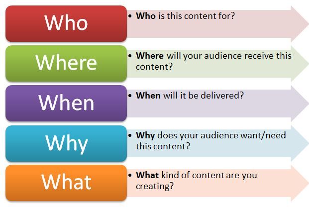
Here’s a handy reference that can be used for any type of content creation – see more on content strategy in my coworker Jess’s post here.
Deliver your message in a way that makes sense. Step away from your preconceptions of what your site should look like, and into your target audience’s collective consciousness. Why did they come to your site in the first place? What reasons might they have for visiting this particular page? What sort of information do they want to see first, and how do they want to see it?
Answer these questions on a case-by-case basis, and odds are the difference will be reflected in improved traffic volume, conversions and social interactions.
Am I missing any pertinent elements of design that can make a difference to user experience? Let me know in the comments and let’s put them on the map.


