This is a guest post. Please note that the views expressed in this post are those of the author and do not necessarily represent the views of Mainstreethost.
In my profession as a web designer, it is not uncommon to hear a client try to explain to me that they can have their high school student build and design their website for a fraction of the cost. Of course they can, but we all know that you get what you pay for. A penny-saving decision like this might end up costing you far more in the long term.
Sure, there are services out there that offer FREE websites or website building platforms that are drag and drop, but are you really doing yourself a favor by saving a couple of bucks to opt into these programs? I can’t help but wonder if now is the time to hang up my coding shoes and pursue becoming a monk because all of my former education and skillsets are completely rendered useless by a WIX drag and drop website builder! Perhaps I should have studied marine biology in grad school.
Obviously, this train of thought is completely ridiculous.
One of my goals as a web designer and developer is to educate my clients as to why the FREE solutions are not always the best. With over 10 years in this industry, I have accumulated knowledge of how these “things” work and how to effectively leverage a design to give the user a positive experience. I’ve also learned how to direct those visitors to the sweet spots on the website – your contact form, free estimate, phone number, or social media outlets.
To do this, we must pay very close attention to detail and effectively deploy the proper techniques in the following categories.
Layout
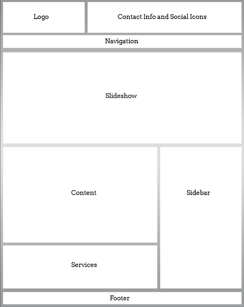
Is your layout orderly and concise, or is it jumbled and convoluted? The organizational scheme of the major elements of your website must make complete sense for your users. Your user interface should be easy to navigate, and all elements should be clearly accessible and legible.
As designers, we make the decisions of why “this” is on the left and why “that” is above or next to “this.” It may sound mundane, but each website has a unique goal and purpose. By clearly wire framing and planning your website out, you will have a well-defined understanding of how your data and content relate to one another – and, most importantly, how that relates to your visitors.
Placement is the key player in this phase of a design and it can make a major difference in your conversion rates!
Color Scheme
We love colors! Just imagine if the World Wide Web was in black and white!
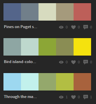
There is so much to be said about color and color theory (perhaps in another blog post). In short, color is one of the most powerful elements of your design. Does your website look dull and drab? Are you effectively communicating the proper tone of your brand to your visitors?
One rule of thumb is to NOT overdo it. Typically, your website should not resemble a Jackson Pollock painting. Pick a color scheme and stick to it! Make sure that you are using the correct colors for the correct moods.
Usability and Utility
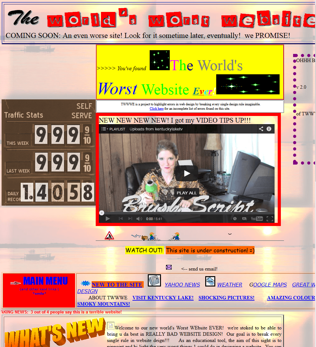
What’s worse than a website that is hardly navigable? I’ve seen some pretty horrendous examples in my career.
If you find yourself asking “How the hell did I get here?”, then the website is doing a poor job of corralling your users to where you want them to be. User interface helps us define clear objectives for the website and what you want people to do when they are there.
As a designer, I have to ask myself, “Is this clear?” A good designer will give your visitors an objective and the user interface will support how they interact with this objective. One of the most important and often overlooked aspects of web design is accessibility. A good website should be accessible on any device, any platform, any modern browser, and should be legible to your visitors. We don’t want users squinting, pinching and zooming on their smartphones to get to the guts of your site – and good thing we have responsive design to remedy such inconveniences.
Typography
Just because you can make your font neon yellow or red and blinking doesn’t mean you should (and it certainly will not further your goal of delighting visitors).
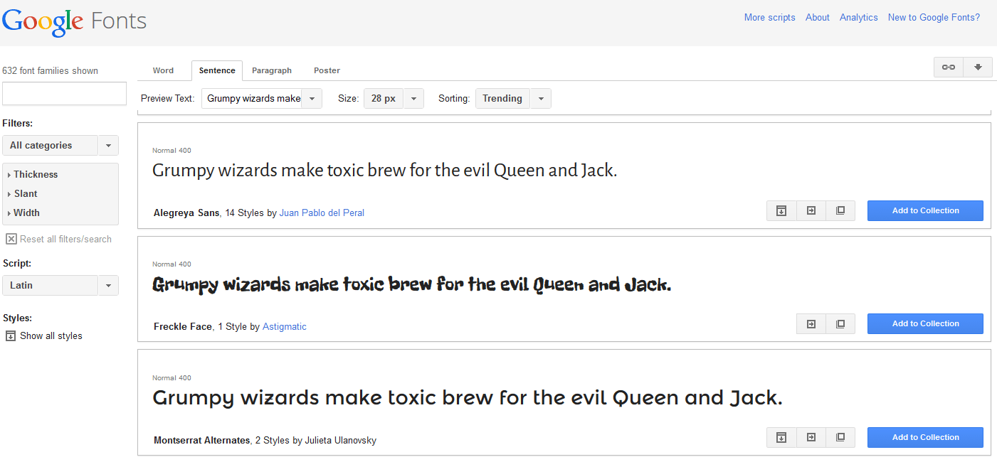
Like color, the font of your website will provide a theme and a mood that coincides with your content. Are you using Comic Sans (God forbid) in your logo for your law firm? The font you choose says something about your brand. We want the words to flow on your website in a manner that’s easy to digest. Your font needs to be “dressed for the occasion”, and we can equate that Comic Sans logo to showing up to a fancy party in sweat pants. Think out the typeset used on your website so that visitors take you seriously (or not… if that’s what you’re going for!)
Design Elements and Calls-to-Action
The call-to-action is a very hot topic these days. These are the graphics or design elements that prompt your users to DO SOMETHING. I mean, what’s the point of the website? You want your visitors to do something, right?
They can get a free estimate, contact you through a form, register for an account, join your mailing list, subscribe to your blog; the list goes on and on. Why not make these actions completely apparent to your users? These types of elements should be brightly colored, ornate, and positioned in such a way that they can’t be missed. A well-devised call-to-action will engage visitors and encourage their participation in your conversion prompts.
All in all, there is a lot to contemplate when approaching how to design and develop a website. On most occasions, I would be willing to wager that most 14-year-old high school kids do not have the experience or the capacity to take all of these elements into consideration when planning an effective online business presence.
That being said, dragging and dropping into a template that thousands of other people have access to may not be your best bet either. When designing and developing a website to represent YOUR business online, please hire a professional – you will be glad you did.


