Designing and maintaining an ecommerce website that provides consumers a positive user experience is a challenge in and of itself. You want to mirror an in-store experience as much as you possibly can to build trust and rapport. Add to that the task of actually selling merchandise through your site and it might seem a bit overwhelming. How do you manage it all?
It’s important to give potential customers the information they need to make an educated purchase decision; but at the same time, overloading them with information might be a turnoff. On the other hand, if you provide too little information, it might seem like you’re trying to hide something.
In addition, you have to make sure that shoppers can easily purchase your products. Nearly $4 trillion worth of merchandise was expected to be abandoned in shopping carts in 2015 alone, and 25% of users abandon their carts due to complicated navigation during checkout. Those are some pretty startling numbers.
But don’t despair! To help you navigate the winding road of ecommerce, look to these 5 companies as a guide.
Amazon
Let’s get the most obvious company out of the way first. Amazon is literally the poster child for ecommerce, but why are they so good at it? It all comes down to search.
Think about how many times you’ve shopped on Amazon (if it’s anything like me, it’s a lot). Why do you shop there? Well, they sell practically anything and everything you could fathom purchasing on the internet, and most importantly, it’s easy to find what you’re looking for. They organize their merchandise into very specific categories, and once you type in a search query, you can refine your results even further.
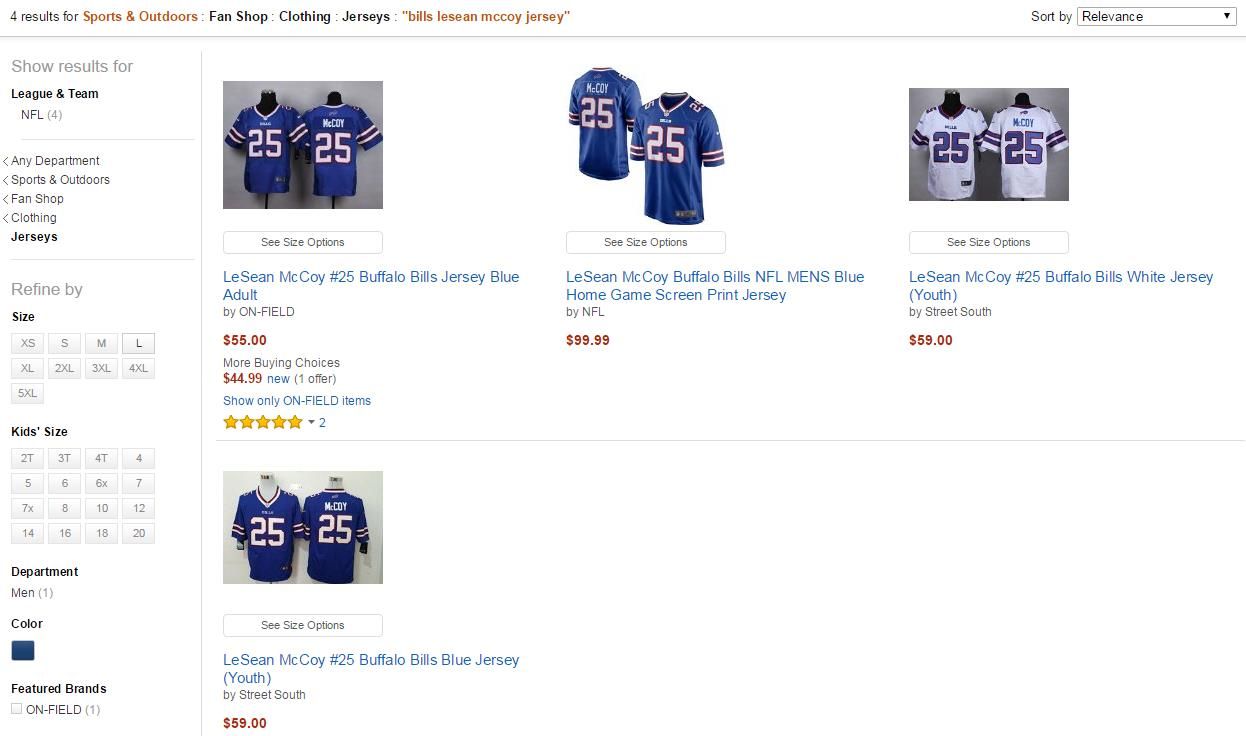
Take this search I did for a Buffalo Bills LeSean McCoy jersey. By simply typing that phrase into the search box, it produces 62 results. That’s quite a bit to look through, especially when they’re not all going to be the exact color or size I’m looking for. To encourage me to make impulse purchases, Amazon also sprinkles related products into the search results.
To refine my search, I clicked “Sports Fan Shop,” “Clothing,” and then “Jerseys,” which ultimately left me with four results to choose from. Since I can wear a kids-size jersey (don’t judge), that leaves me with two relevant products. I can then decide if I would rather have the “home” blue jersey or “away” white one, and be on my way.
While there might be several steps between my initial query and finding the exact product I’m looking for, it saves a lot of time in the long run by not sifting through pages of items that I’m not interested in. Amazon understands that if you cannot figure out exactly what shoppers are looking for, they’ll simply go to a different website that can. Their search tools allow them to act like a sales associate, showing you around the site until you get to the item you’re searching for and suggesting other products you might be interested in along the way.
The North Face
The North Face is an industry leader when it comes to outdoor apparel, and their ecommerce site leads the pack as well. They succeed online because of the effectiveness and appealing nature of their product pages. When you’re searching through a specified category of merchandise, you have the option to select “Quick View” to get a general overview of the item. If you decide that you’re interested in learning more about the product, you can select “Product Detail” and head directly to the product page.
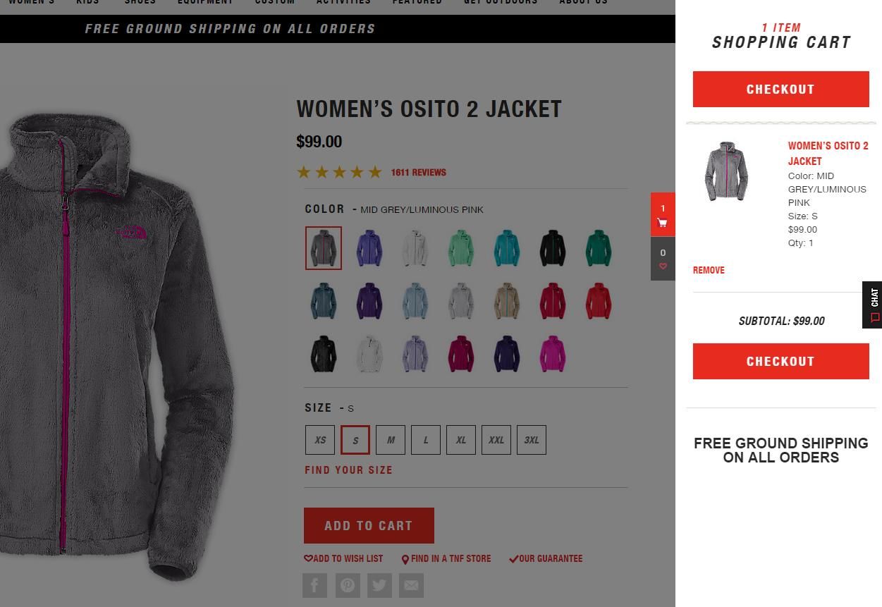
Once you’ve clicked on a color and/or size to add to your shopping cart, a toolbar pops up on the side of the page to confirm what you’ve selected and offer a direct path to the checkout. If you’re not finished shopping, you can simply click back on the main page and the toolbar will disappear.
I love this element of the shopping cart because it quickly summarizes the product you’ve selected to ensure that you chose the right one. Oftentimes, shopping carts require you to leave the page you are on entirely to see what’s in your cart and make any necessary modifications. By having this toolbar appear on the side of the page, I can see that I selected the grey-colored jacket; however, if I meant to click on the purple one next to it instead, I can quickly go back and make that adjustment. The North Face hits UX on the nose with this feature.
Nasty Gal
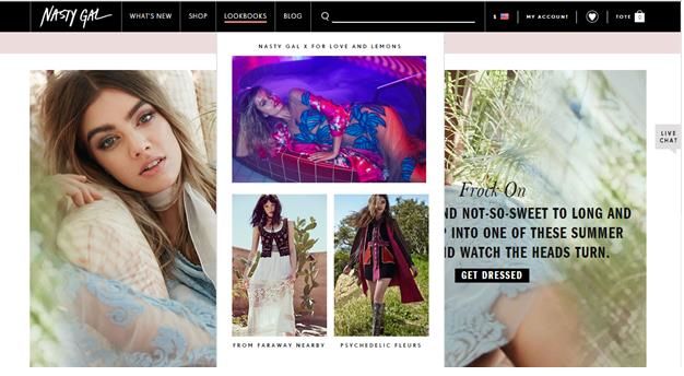
Nasty Gal is an example of an ecommerce website that truly creates a retail store feel online. As soon as you land on their website, you know what their brand is all about through the use of feminine colors and fonts, as well as high-quality images of their products. One of my favorite parts of the website is that when you hover over the tabs in the main navigation, there are vibrant images within the dropdown menus. These graphics further entice you to shop on the site as well as help you find what you’re looking for.
Also like a brick-and-mortar retail store, Nasty Gal clearly displays any current sales and promotions going on in a separate toolbar at the top of the homepage. It’s offset from the main navigation in a light pink bar, so it quickly grabs your attention and you can shop knowing what offers are available. On many ecommerce sites, you don’t find out until you get to the checkout that you can qualify for free shipping by spending $X or that dresses are buy one, get one half off. Providing this information up front allows shoppers to strategically plan their purchase to take advantage of certain deals, as well as potentially persuade them to spend more than originally planned.
To complete this in-store feel, they have a “Live Chat” button located on the right-hand side of every web page so you can connect with customer service if you have any questions. Having that button constantly present reminds you that just because you’re shopping online doesn’t mean you have to figure everything out on your own. It greatly adds to the user experience and builds trustworthy perceptions of Nasty Gal as a brand.
Crate and Barrel
Companies in the design and home décor industries know the importance of helping consumers visualize products in their home. Each piece is a part of a room’s particular style, and must be coordinated with several other items to get that finished look. While some shoppers would be hesitant to make such major purchases online, Crate and Barrel’s site provides reassurance that you can put together designs for your home without having to step foot in a store.
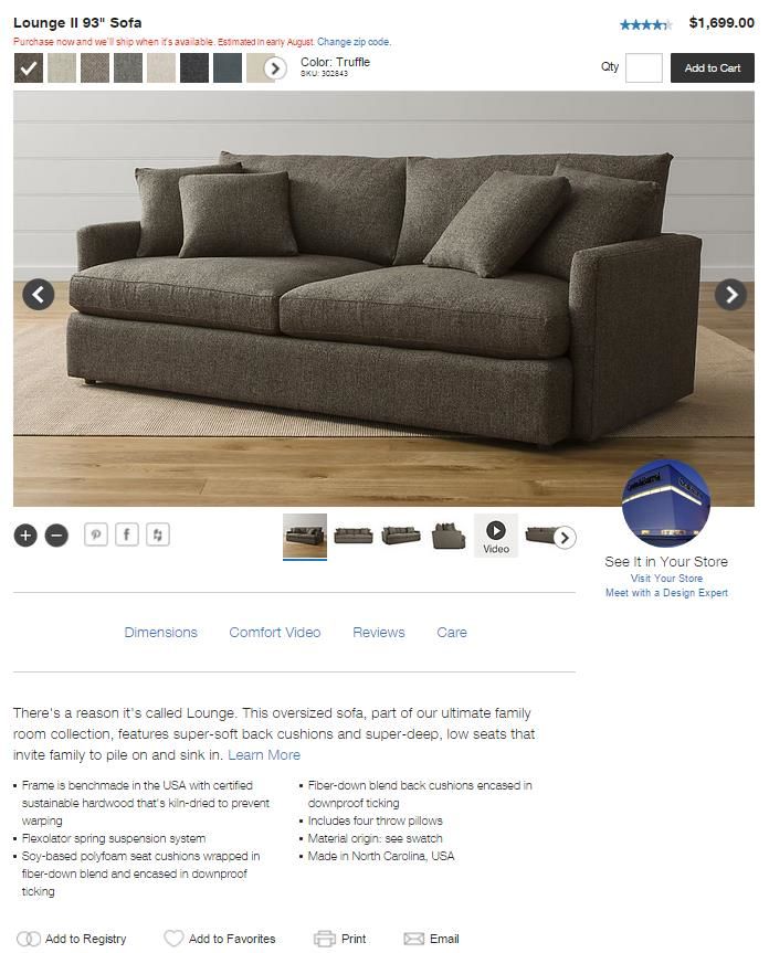
Their product pages allow you to view items from a variety of angles, zoom in and out, and even share to your Pinterest or Facebook accounts. Pinterest in particular is key for companies in this industry, as users often have a board specifically designated for interior design and might group items together to plan out a room’s décor.
In addition, each product page includes a brief description that adds personality to their merchandise. For the lounge sofa I selected below, this description is featured: “There’s a reason it’s called Lounge. This oversized sofa, part of our ultimate family room collection, features super-soft back cushions and super-deep, low seats that invite family to pile on and sink in.”
The description takes the shopping experience beyond simply purchasing a couch for your living room; it helps you envision exactly what the purpose of the product is. Appealing to a shopper’s emotions by hinting at how it brings families together, it adds a human element that may encourage shoppers to be more comfortable with making this type of purchase online.
For more information about each product, there are links to short videos, product reviews, and care instructions. I also noticed that once I was on this particular page for about two minutes, a pop-up appeared on my screen asking me if I had any questions and would like to speak to a sales associate through a live chat. They gave me just long enough to check out all of the information before asking if I had any questions. Crate and Barrel conveys customer service done right.
Tim Hortons
Finally, mobile user experience has become a crucial part of a company’s online presence. If your website isn’t responsive or compatible with mobile devices, potential customers may turn to another resource and mobile search rankings will likely drop. Tim Hortons is an example of an ideal mobile experience, by featuring just enough information to educate consumers without overwhelming the smaller screen that the site is being viewed on.
If you’re on Tim Hortons’ website on a mobile device, why are you there? You’re probably looking to find a location nearest you or figuring out what you’re going to eat and drink when you get there. And the first things you see on the homepage are a store locator tool and a link to the nutrition calculator.
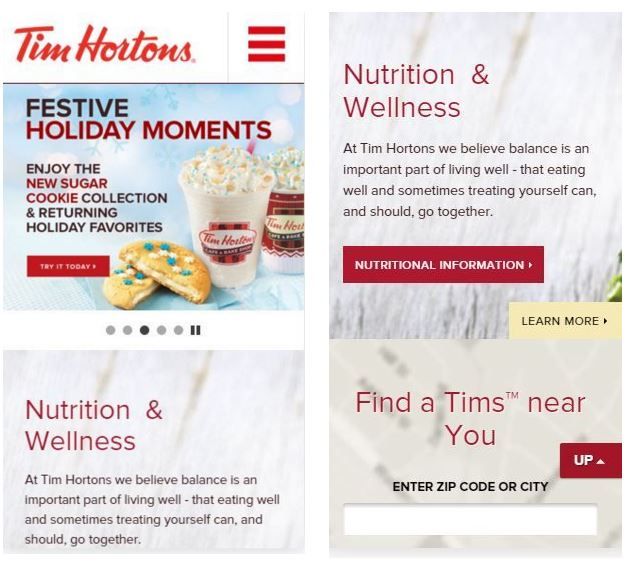
The website also allows you check the balance of your gift card and add money as needed, as well as take advantage of their mobile pay option to expedite the purchasing process when you’re in their restaurants. For those not lucky enough to have a Tim Hortons in their city, you can purchase coffee and other merchandise directly from the site. So while shopping may not be their number one focus, they recognize the importance of having their products available to consumers around the world.
Designing a website, let alone an ecommerce website, requires you to consider how you want your brand to be portrayed. How will you use your online voice to educate consumers and ultimately convince them to purchase from you? User experience should remain top-of-mind during the design process and throughout the continued maintenance of your site. These five companies make shopping easy and fun, have a strong brand presence, and ultimately create an experience that brings consumers back time and time again. If you can incorporate one or more of these elements into your ecommerce site, you’ll likely do the same.

