Do you take the same bit of writing in Comic Sans as seriously as you do when it’s in Helvetica? Of course not, and this is because the way words are presented can drastically affect our perception of their meaning.
It’s apparent that typeface does affect the way we absorb textual content. But exactly how significant is it?
Before we begin, I think it’s necessary to dispel the myths behind comparative legibility in serif and sans serif fonts. In 2008, UX consultant Alex Poole published a comprehensive analysis of over 50 past empirical studies and was able to draw several important conclusions:
- Serifs don’t help guide the flow of the reader’s eyes, nor do they improve cognitive identification or character spacing. And although some studies have found a majority of readers prefer serif fonts in body text, this is largely due to visual familiarity and not intrinsic legibility.
- Sans serif fonts do not cause eye fatigue at small point sizes any more than serif fonts do. They don’t hold display advantages on modern, high resolution computer monitors, and they aren’t any more advantageous than serif fonts for children learning to read (as previously proposed).
The fact remains that there are no glaring advantages or drawbacks to legibility when using one or the other (and if you don’t believe me, reference Poole’s conclusions and the plethora of studies he cites).
Now that we’ve established the ground rules for concrete legibility, it’s time to dive into the more abstract realm of psychological perception (oooo, fun!). Let’s see how different typeface families, sizes and styles can change the way people feel and think about your words.
Our Font-driven Perceptions
It turns out that research on the psychology and cognitive side effects behind different typefaces has a history stretching back over 100 years. That being said, a chunk of this research has been marked unsound, inconclusive or otherwise criticized for its inconsistencies.
But there are a few highlights, and even the theoretical experimentation presents some plausible conclusions.
In 2012, writer Errol Morris of The New York Times conducted an interesting incognito study of his readers in which he presented the same content to them, but in a varying typeface for each visitor. He then proceeded to survey these readers on their level of agreement or disagreement with what they just read.
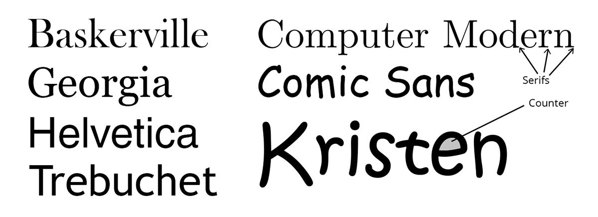
With over 45,000 survey completions and thorough analysis by a Cornell professor of psychology, the results were conclusive. Of the six different fonts presented (Georgia, Baskerville, Computer Modern, Comic Sans, Trebuchet and Helvetica), the formal, “starchy” Baskerville took the cake for survey agreement. It also correlated with the lowest percentage of disagreements and resulted in a marked 1.5% advantage over the other fonts. Simultaneously, Comic Sans resulted in the lowest number of agreeing responses.
The evidence in this case suggests that readers find serif-based fonts with a studious aesthetic to be more credible than looser, more illustrative fonts. For clarification, we can look to the mockingly disgruntled public outcries following the ex-pope’s official photo album captioned in Comic Sans, as well as CERN’s huge Higgs-Boson particle discovery also styled with Comic Sans.
Differences in cultural background can also contribute to an individual’s perception of typeface. In a study completed by Thai researchers from Chulalongkorn Business School, native English-speaking and native Thai-speaking participants were asked to rate which adjectives they felt were associated most closely with the “handwritten” font Kristen. The results saw a correlation between the responses of both groups, but the English respondents displayed notably stronger ratings one way or another (where the Thai respondents swayed the same way, but with ratings that were closer to neutral). This may potentially reflect the fact that font choice is more closely scrutinized by certain cultures than others.
And then there’s the case of the guy who got better grades when he swapped out the font in his term papers.
Over the course of a six semester academic stint, Phil Renaud wrote a total of 52 essays using three different fonts between them: Times New Roman, Trebuchet MS and Georgia. The average grade for Times New Roman was A-, the average for Trebuchet MS was B-, and the average for Georgia was an A. Coincidence? Or was there a legitimate correlation between the sophisto serif font and record high grades?
This example is less than scientific, but brings up a very interesting possibility about catering your font to your target audience. If you’re serving the academically-minded, avoiding something like Comic Sans or Kristen is a no-brainer. But a tuxedo (as Morris described it) serif font such as Georgia or Baskerville could insinuate an intellectual air for those reading it. The other side of this speculation is that a fresh change of font for an audience who’s used of the same thing over and over could conjure positive perceptions, solely based on the fact that it’s different.
The big takeaway here points to the variety of emotional responses something as seemingly trivial as a font can evoke. Whether you’re designing a corporate webpage or just writing a college essay, consider the context and realize that your choice of font should be directed to the inclinations of your target audience when applicable.
What We’ve Learned in a Nutshell
- Formally styled serif fonts such as Baskerville and Georgia may improve the perceived credibility of a written statement compared to looser, more illustrative typefaces (such as Comic Sans, which may have the opposite effect).
- Following decades of [scattered] research, there’s no proven difference in legibility between serif and sans serif fonts.
- Cultural background can affect the way individuals perceive a font’s personality and worth.
- Readers are subconsciously inclined to favor familiar fonts. But in the right context, using a font that stands out from the everyday choices may yield an improved user experience.
- People still, and will forever, hate Comic Sans.
While I haven’t conducted any empirical studies of my own and some of this information is speculative, the conclusions can certainly lend a hand when it comes to font selection and user experience design.


