Facebook is currently the leading social media platform, and has been since it was launched in 2004. As one of the oldest channels, it has been able to sustain a larger user base than any other channel to date, reporting around 3 billion monthly active users worldwide.
The main goal of Facebook is to help users stay in touch and build relationships. As a community-based platform, Facebook makes it easy to share milestones, make announcements and keep your “friends” close, even if they’re halfway across the world.
And as a business, you should think along the same lines as a user: actively stay connected with your audience and foster a relationship with each member in your community.
This platform is your award shelf; a curated display of your best self. Your content should include company achievements, instances of growth, upcoming events, office culture—anything that aims to keep your audience updated and involved in your story.
Facebook is also the perfect platform to gain the public’s trust and build up brand loyalty so it’s important to make sure your content looks good.
The visuals you incorporate on your Facebook profile, business page, event, group, etc. matter—they come together to create the overall experience of your brand on this channel. But every social media platform has their own image size guidelines. So even if you’re using all the right colors and have a strong message, if your image is awkwardly cropped, you’ll be catching users’ eyes for all the wrong reasons.
Luckily, we have you covered.
Below you’ll find all the Facebook image dimensions you’ll need to create perfectly sized visuals, plus a few design tips to take with you!
Facebook Profile and Cover Photo Dimensions
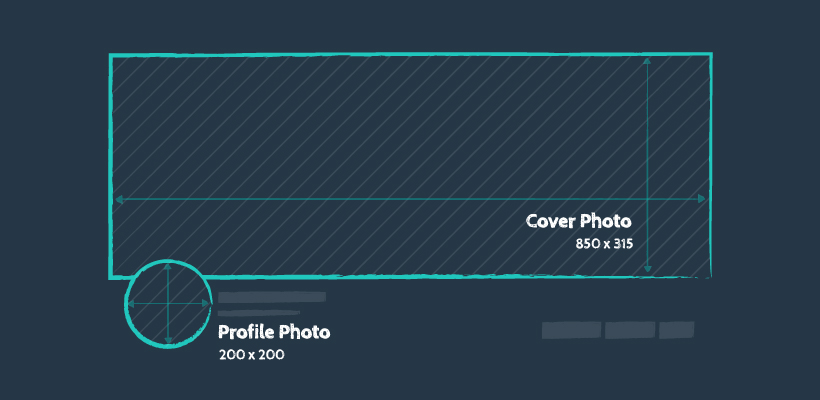
Your profile picture should be simple and straightforward—something that would be easily recognizable as your brand. Aka, your logo.
Your Facebook profile photo will sit in the upper lefthand corner of your page with a scaled down version in the feed when you create a post or leave a comment.
Keep in mind, Facebook crops your image into a circular shape so make sure all important elements are away from the edges—especially the corners.
Profile Photo Sizes
- Recommended: 200 x 200 px
- Minimum: 180 x 180 px
- Aspect Ratio: 1:1
- Desktop Display: 168 x 168 px
What should your cover photo be?
Just like your profile picture, your cover photo should be a welcoming representation of your brand with the goal of creating a lasting (good) impression.
It’s the hero image of your Facebook page—the first thing users are really going to take in.
The colors should match your brand and any messaging should be relevant and concise.
You can now also have a Facebook cover video instead of a static image. This would follow the exact same size guidelines and can be anywhere from 20 to 90 seconds long.
Cover Photo Sizes
- Recommended: 850 x 315 px
- Minimum: 400 x 150 px
- Aspect Ratio: 170:63
- Desktop Display: 1250 x 463 px
Facebook Shared Image Dimensions
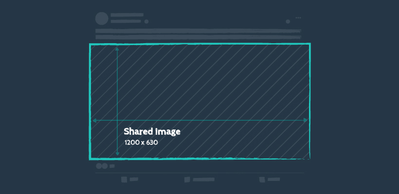
What images should you be sharing on your Facebook Business Page? Great question! This platform is perfect for a wide variety of content; behind the scenes photos, project updates, visual stats, holiday wishes, and company announcements are a good place to start.
Timeline photos are a great way to drive engagement and boost your brand image—these visuals should be high quality and highly shareable.
When uploading an image to your timeline, Facebook will automatically resize your photo to be 500 pixels wide to fit its preferred ratio: 1.91:1. So, sticking to the recommended dimensions will ensure a professional looking post for your page.
Now, if you’re sharing multiple images in one post, 1200 x 1200 px would be best.
- Recommended: 1200 x 630 px
- Minimum: 200 x 200 px
- Aspect Ratio: 40:21
- Desktop Display: 500 x 261 px
Facebook Shared Link Dimensions
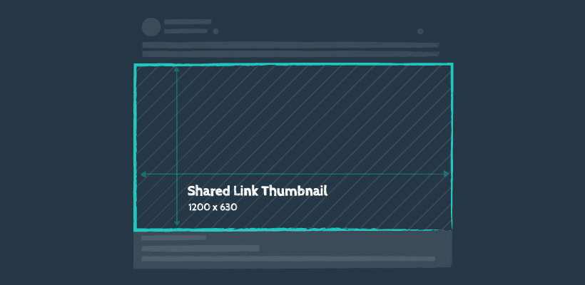
Arguably some of the most vital visuals on your business page are images in link shares. Whether you’re sharing your latest blog post, a fun company update, industry news or your next promo, the image that appears will be your opportunity to pique the interest of a user scrolling by.
These images have to be on point in design and compelling in message because if done right, you will have succeeded in getting your audience to take action and click your link!
Just keep in mind that if your image is smaller than 600 x 315 px, the image will still display with the link, but on a much smaller scale that won’t look too great in the News Feed.
- Recommended: 1200 x 630 px
- Minimum: 600 x 315 px
- Aspect Ratio: 40:21
- Desktop Display: 500 x 261 px
Facebook Event Cover Photo Dimensions
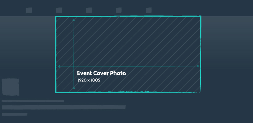
Hosting an event soon? Make sure your Facebook event page has everything you need to stand out from the rest. Your event cover photo plays a vital role in attracting Facebook users to explore your event and hopefully attend.
The recommended size for an event cover photo is 1920 x 1005 px. Some companies like to include event information right in the cover photo as well, so the dimensions of this area are not something to mess around with.
And fortunately, when your event shows up in the upcoming or suggested events sections, Facebook takes some of the work off your hands, automatically scaling the image down to a thumbnail.
- Recommended: 1920 x 1005 px
- Minimum: 400 × 150 px
- Desktop Display: 665 x 374 px
Facebook Group Cover Photo Dimensions
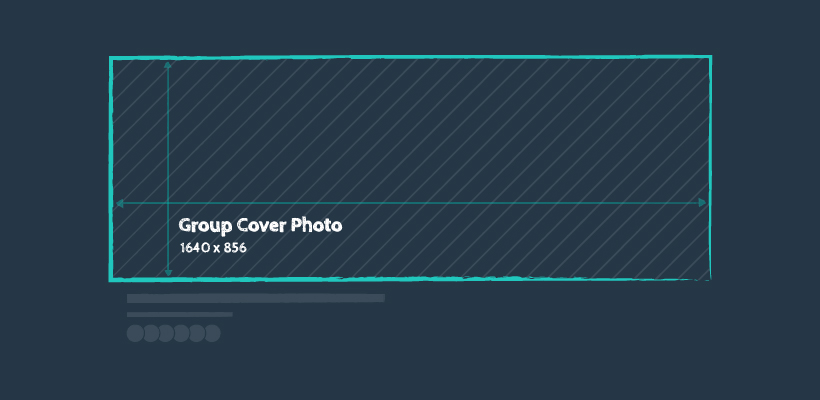
Facebook groups are starting to become a staple in a lot of businesses’ social media strategies—from offering more attentive support to sharing exclusive offers, Facebook groups are the perfect way to grow and nurture your online community.
But sometimes you’re so focused on the group engagement that some of the smaller details slip through the cracks, like the correct size of your cover photo…
This is such an important part of your Facebook group because it’s multi-functional. A new (and interesting) cover can serve as a great first impression, a conversation starter, or an informational banner that presents the latest news and offers.
The recommended size for your Facebook group cover photo is 1640 x 856 px.
Just keep in mind that when displayed on mobile, you won’t be seeing the entire image, so keep any important elements of your cover photo away from 96px from the top and bottom just to be safe!
- Recommended: 1640 x 856 px
- Text Safe Area: 1640 x 664 px
- Aspect Ratio: 1.91:1
- Desktop Display: 965 x 504 px
Facebook Stories Dimensions
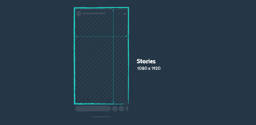
And right at the top of the News Feed sits your Facebook stories. These updates stick around for only 24 hours and won’t be shared to your timeline or the main news feed. You can create your stories on the fly, but wouldn’t it be so much easier if you had the image or video (accurately sized of course) ready to go live? We think so, too.
- Recommended: 1080 x 1920 px
- Minimum Width: 500 px
- Aspect Ratio: 9:16
- Image File Type: JPG or PNG
- Max Image File Size: 30MB
- Video File Type: MP4 or MOV
- Max Video File Size: 4GB
Quick Facebook Design Tips
- Your profile picture and cover photo should complement each other. With your profile picture most likely being your logo, you can think of your cover photo as an expansion of that. This is a space that allows for more text, info, and interesting elements. Easily carry over your brand colors and a focused message in order to really stand out with your followers.
- Play with fonts, but make sure they’re legible. Keep design best practices in mind—if you have a fun font, maybe balance it out with a simple font to keep the graphic intriguing and playful, but also effective in delivering a message.
- Keep content visually on brand. Thinking about your business page as a whole, you want to provide a visually appealing, cohesive overall look. So yes, continue to design various content, but stay close to your branding guidelines.
- Don’t forget to pin your most important post to the top of your page!
For all of your content creation needs, check out our Social Media Image Size Cheat Sheet. Discover essential image dimensions for the most popular social media networks so that your brand can stay consistent across platforms and look good while doing so. 😉

