Creating an attractive, compelling call-to-action can oftentimes be the deal-breaker when attempting to entice qualified leads that will eventually convert.
Whether it’s a business homepage, blog or email, failing to deliver that critical message that in turn will spark customer engagement (call, click, download, like, visit, buy!) will, in the end, cost your company money. It’s not simply all about delivering a compelling message, either. Design matters, too.
Nonetheless, the end goal remains the same: to point visitors toward what they were already in search of or steer them in a direction that will directly lead to an action that helps business. Furthermore, according to HubSpot, a “call-to-action is an image or text that prompts the visitor to take action, such as subscribe to a newsletter, view a webinar or request a product demo.”
So it’s important to implement several different calls-to-action and distribute them throughout your online marketing presence, including your web pages and various forms marketing material.
Tips for Strong Calls-to-Action
There is no shortage of excellent tips for creating effective calls-to-action scattered throughout the Internet, but there are a few that should be top priorities. In terms of creating stellar and engaging copy and attractive design for calls-to-action, here are five simple rules of thumb I’ve picked from various resources on the web:
- Use powerful action verbs: “Discover why our product works for our 5,000 clients.”
- Give exact numbers: “Save 30 percent off your entire purchase.” According to CopyBlogger, your job is to “spell it out” for your customers, even if that means including the words “Click Here.”
- Offer should be clear and concise and deliver value: “Download ebook and learn the 10 tips to social media marketing.” Give visitors reason to fill out your form, but also let them know what exactly it is they’re getting in return.
- Make it visually appealing: Use bold and contrasting colors, shapes and sizes to stand out and prompt visitors to take action.
- Be visible “above and below the fold”: To go along with using contrasting colors and shapes, make sure your call-to-action is visible above and below the fold. This ensures that you have multiple calls-to-action per page.
Additionally, don’t be afraid to A/B test your calls-to-action. Swap colors, change sizes, alter positioning or flat out change the phrasing. Be patient, but also seek better ways to convert.
Examples of Small Businesses Utilizing Calls-to-Action
Now, it would have been quite painless to scope the interwebs for exceptional calls-to-action from some of the more established businesses with large-budget online marketing strategies. But I figured it would be more helpful for small businesses to get a look at some similarly sized businesses with strong calls-to-actions instead.
1. Bocce Club Pizza
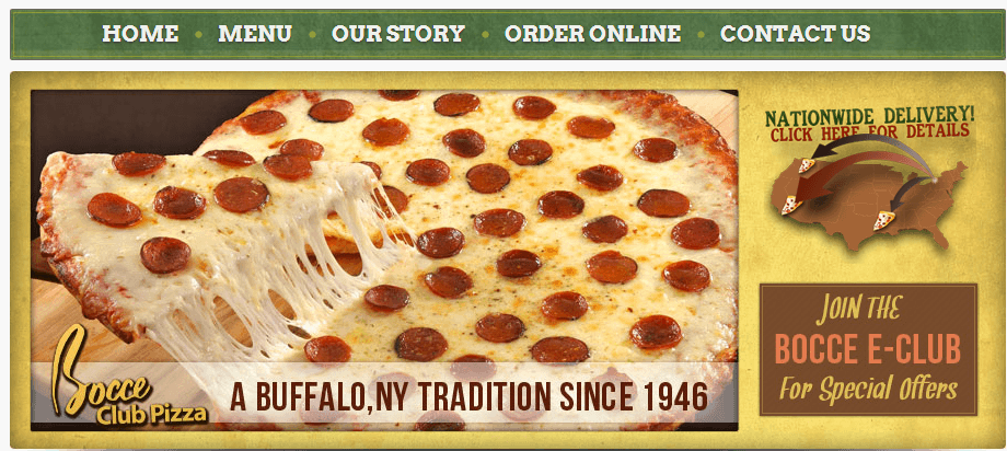
A small, family owned pizza joint in Buffalo, N.Y., Bocce Club Pizza has several subtle yet brilliant calls-to-action on its homepage. All of the calls-to-action change in some way as you hover over them with your cursor, including a button that reads “Join the Bocce E-Club For Special Offer,” which starkly turns black when you move your mouse over the box.
2. Salvatore’s Italian Gardens Restaurant
The family owned Italian restaurant also has several subtle but solid calls-to-action on the homepage, including a quick form to join its mailing list for important news, updates and deals. When you first visit the page, however, there’s a not-so-subtle call-to-action which immediately caught my eye because it swirled onto the page upon visiting.
3. Medi-File
Secure document storage company Medi-File Document Management Solutions also wisely utilizes contrasting colors as you hover over a button on the top-right corner of the homepage. The button turns Kelly green as you move your cursor over it and it also prompts visitors to perform one or two options.
4. Superior Heat Company
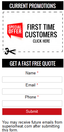
Chances are that if you’re in need of a heating or cooling company, you’re in a pinch. Superior Heat Company wastes little time pointing you in the right direction with a button to schedule an appointment at the top right-hand corner of the page. But perhaps best of all, they have an ever-welcoming deal for first-time customers, too.
5. Fielder’s Choice Bat Bags
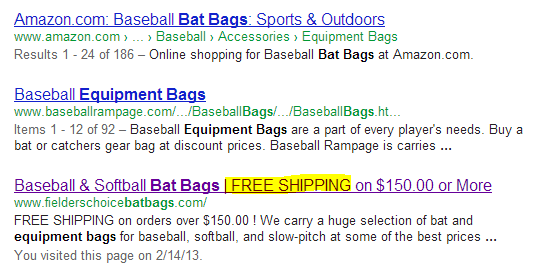
Lastly, I thought I’d mention a business that took a different route in terms of a clever call-to-action. We all know how important it is to stand out from the crowd on SERPs. Baseball and softball equipment bag online retailer Fielder’s Choice Bat Bags ingeniously boasts a call-to-action in its search result, boldly stating that it offers “FREE SHIPPING” on orders $150 or more.


