Whoever’s responsible for writing your content — whether it’s you, an in-house team, or a freelance writer — is also responsible for spicing up that content.
Two of the most popular ways to do so are by creating infographics and SlideShares. The trouble is choosing which one to use.
We decided to make it simple by laying out both options below to help you determine which format is best suited for your content and goals.
Infographics
Infographics are single graphics full of data visualizations that simplify complex information. Their use of colors, graphs, images, icons, and illustrations make them stand out amongst the endless pages of text on the internet. Infographics are easy to comprehend, save, and share — which makes them extremely useful for any business, brand, or blog.
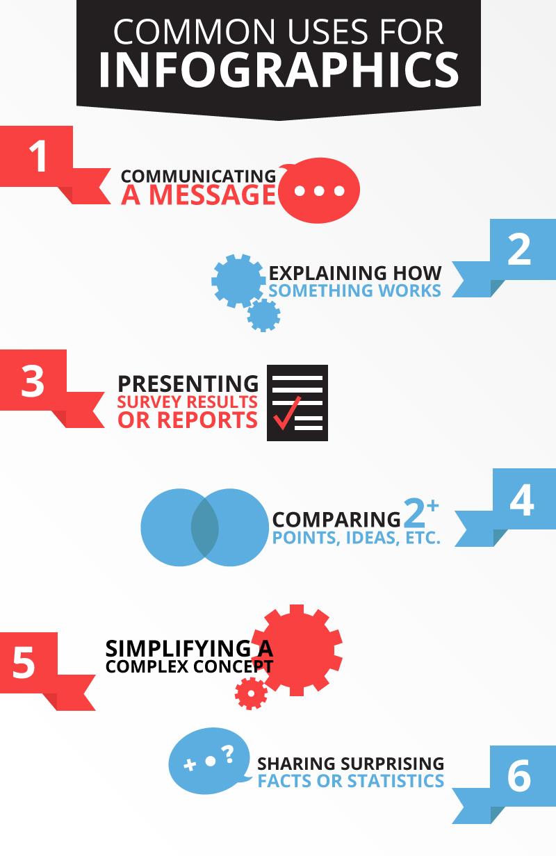
While it is possible to create an infographic for any topic, there are instances where they can be especially successful. Generally, infographics are used for:
What’s the value in visualizing information instead of just writing about it? High-quality infographics are 30 times more likely to be read than text articles, and 40% of people respond better to visual information than text. With over 2 million blog posts being written per day, an infographic can help make your post stand out.
Other Advantages of Creating Infographics:
- They (sometimes) go viral
- Infographics are liked 4x more and shared 2x more than presentations on SlideShare
- They’re shared 3x more than articles on LinkedIn, Twitter, and Facebook
- They’re easy to share across all social media platforms
- At Mainstreethost, we upload our infographics to Visual.ly and receive a ton of visibility through their network of users
- They’re relatively easy to create
- There’s a plethora of pre-made templates and online tools available to design infographics (if you don’t have a graphic designer on hand)
- They position you as an expert in your field
However, You Should Also Be Aware of Some Disadvantages To using Infographics:
- You can’t include links within the content
- Although, you can link the entire infographic to one source and/or list your sources in the text
- They are not always SEO-friendly
- Since an infographic is essentially one image, there isn’t much text for search engines to crawl
- Be sure to add alt text to the image so search engines have something to read
- You don’t have as much analytics ability as with SlideShares
- Infographics aren’t as interactive as SlideShares, so there’s less available to track
SlideShares
Acquired by LinkedIn in 2012, SlideShare is a site where users can privately or publicly upload PowerPoint, PDF, Keynote, or OpenDocument presentations. These presentations are (as you might have guessed) called SlideShares.
Similar to infographics, SlideShares use colors, graphics, and images to visualize information. Therefore, their uses are also quite similar:
While SlideShares might be utilized less often than infographics, 18 million presentations have been uploaded as of 2015 — and that number is only increasing.
SlideShares Have Impressive Advantages That You Can’t Get with Other Content Formats:
- They’re perfect for recapping events, speeches, etc. to get more out of existing content
- They have lead generation tools that aren’t available with your standard infographic
- You can create lead forms to better connect your audience with targeted content
- The ability to add links throughout your presentation
- They’re SEO-friendly
- There are more analytics options on SlideShare
- Along with Google Analytics, SlideShare has its own analytics software right on their platform
- You can design an infographic on the SlideShare platform to get the best of both worlds
However, SlideShare May Not Be the Best Option for Your Content Because:
- They’re less likely to go viral
- They take time to make
- You have to create your presentation in another application (like PowerPoint, Google Slides, etc.) and then upload it to SlideShare
- They’re a little old-fashioned
- Slideshows have been around for a long time and can sometimes feel boring or generic
If you’re still unsure about which format is best for your content, it’s okay. Sometimes there isn’t a clear right or wrong answer. In fact, your content may prove to be successful in both (or neither) formats.
That being said, if you can’t seem to make up your mind yet, we’ve created a quick checklist to help you decide!
[infographic_vs_slideshare]




Great article Kathryn:) I can say that we should all create infographics and also SlideShare presentation and then measure the right metrics and see which one is driving the best results.
Thanks, Robert! It is definitely a great idea to use both formats and keep an eye on your metrics to see what works best for you. Your article is certainly insightful as well, thanks for sharing!
Best Regards,
Kathryn
Loving this infographic Kate! Love how you said that it’s okay if you’re unsure about which format is best for your content, because your content may prove to be successful in both formats! Or neither 🙂
Thank you, Anja!
I’m glad you enjoyed the article. Some content will work easily in both formats, but when that’s not the case it’s certainly nice to have a little cheat sheet to help you choose.
Thanks again!
Kathryn
Everyone loves good cheat sheet 😉