Mobile or responsive: What’s the better approach for appealing to your mobile audience? There are certainly arguments in favor of both options, and no definitive right or wrong answer. It ultimately comes down to what your target audience needs in terms of a digital experience and the time and budget you can commit to the project.
Let Me Back Up. How Do Mobile and Responsive Websites Differ?
A responsive website is one that automatically adjusts its dimensions to the screen that it is being viewed on. Nothing is more frustrating than visiting a website where you have to constantly zoom in and out for text to be legible on your mobile device, and a responsive design prevents this by detecting the screen size and adjusting the layout of content accordingly. The major benefit is that you only have to design and manage one website, which is especially helpful for companies that don’t have the time or money for multiple sites. However, you’re able to do this without degrading the user experience on one device or another.
On the other hand, a mobile website is a completely separate site designed for mobile devices. Generally speaking, they contain less content and simpler navigation compared to a desktop site to appeal to the smaller screen. A mobile site allows for more efficient searching and to specifically cater to what users are looking for (often location/contact information or quick ordering).
Why Make More Work for Yourself with A Separate Mobile Site?
This is a great question. It can be time-consuming just to manage one website worth of content, let alone two. And don’t we have enough work on our plates as it is?
The most common argument in favor of mobile websites is that a mobile user’s needs tend to vary from desktop users. Think about when you’re visiting websites on your phone or tablet. What type of information are you typically looking for? You might be looking for a company’s phone number, ordering food from a restaurant, searching for the nearest store to your house, or reading customer reviews. Users won’t always complete thorough research on a smaller screen, so it can be advantageous to create a separate mobile site for these needs.
In 2012, the “Seven Shades of Mobile” study was conducted to break down how people spend their time on mobile devices. The findings determined that, on average, consumers spend over two hours per month actively shopping on smart phones (not just browsing) and over one hour per month planning trips or other leisure activities. These two categories alone account for nearly 20% of a user’s time online. And with mobile being even more prevalent today, these numbers will just continue to rise.
Other benefits of a mobile site have to do with user experience. Since a mobile website generally has less content on its pages and the site was designed specifically for mobile, the load time should be pretty fast. And with 74% of mobile users bouncing from a site that takes five seconds or longer to load, you want to be sure you don’t keep them waiting. A mobile site also improves the user experience for local searches because location and contact information is readily available. About 40% of mobile search is local, and mobile websites tend to have a higher chance of ranking in these results since they target their audience more narrowly.
How to Determine If a Mobile Site Is the Right Fit
At the end of the day, most mobile users aren’t going to care if you have a responsive site or a separate mobile one. They just want the site to be compatible to their device and provide the information they’re looking for. It ultimately comes down to what your business can manage and how different your mobile users’ needs are from your desktop users. So how do you determine that?
The first place to start is Google Analytics. Look at how users are visiting your site; is it primarily on a desktop or a mobile device? If a large percentage of your traffic is mobile, then it is even more important to ensure a positive user experience for visitors, which could include creating a mobile site. It’s also important to pay attention to the bounce rate and conversion rate of mobile users to determine if that traffic brings in enough revenue to make a separate site worth the investment. Finally, keyword research is crucial to determining the best fit. Consumers might be using very different keywords depending on the device they are searching on, and if so, a mobile site would help capitalize on these varying terms.
Examples of Companies Successfully Utilizing Mobile Websites
Southwest Airlines
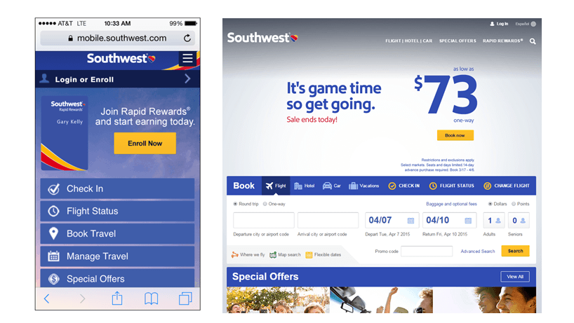
The airline industry has taken advantage of the growth of mobile sites by allowing customers to book flights, check in, and access their boarding pass directly from their mobile device. Southwest Airlines is able to provide the same features across websites by removing a bit of the visual appeal to accommodate a smaller screen. Even though the images and ads are removed, there’s no mistaking Southwest’s website for a competitor’s and it’s still a high quality site. Like many larger companies, they also have a mobile app that mirrors their mobile website. If you’re not a frequent traveler, you may not want to give up precious space on your smart phone to download their app, so you can go to the mobile site for an identical user experience.
Papa John’s
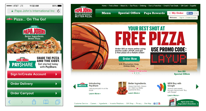
The company understands that the primary reason for going to their mobile site is to order food, so they make that the focal point. If you’re on a mobile device, chances are you already know what you want to order or you’ve looked at the menu on a desktop site, so you just want to find a location nearest you and place the order. Another great feature that’s readily available is an option to login to your account, which remembers your contact and delivery information and makes it easy to reorder something you’ve ordered in the past. Frequent customers also earn rewards for future discounts or free menu items. Papa John’s removed a lot of the fluff from their desktop site to provide a simple ordering experience for hungry customers on-the-go.
Sephora
Compared to the previous examples, Sephora’s mobile site visually resembles its desktop site the most. The biggest difference is that the desktop website places a greater emphasis on the rewards for “Beauty Insiders” as well as free makeup tips and advice, whereas the mobile site makes easy shopping the priority. I couldn’t even find links to their “Advice” and “How-To” tabs on my phone, so they must have determined that those topics aren’t a priority for most mobile users. Like many other retailers, the mobile site has a menu button in the top corner to search by more specific categories, but again there’s probably a good chance you already know what you’re looking for. You may have woken up this morning to find out that you’re running out of sunless tanner and need to resolve the issue stat, so you make a quick purchase on your phone and go on with your day. Crisis averted!
As evidenced above, some popular industries for mobile websites are restaurants, retail, health and beauty, and travel. The main commonality between these industries is that when you’re searching on a mobile device, there’s a good chance you’re looking for location or contact information or to make a quick purchase and get that instant gratification. The majority of your research has likely already occurred or it’s a frequently purchased item that doesn’t require much thought. However, if your company doesn’t fall into one of these industries, that doesn’t mean a mobile site isn’t for you.
To determine the best strategy for your business, you need to look at your overall marketing and financial goals, website content, and the time and budget you can commit to the project. If you have content that changes frequently or don’t have enough time to spend managing multiple websites, then a mobile site may not be for you. But if you have a strong mobile user base with differing preferences from desktop users, it may be worth your while to make the investment.
To learn more about mobile websites and to compare them to responsive designs, check out this infographic from Kathryn Wheeler.


