It’s a debate that has been ongoing for years: should businesses be spending time and money on separate mobile websites and mobile applications, or should they strictly adapt their current site with responsive design?
Ian Lurie, CEO of Portent, recently wrote a guest blog post for Forbes.com, detailing why you should stray from investing time, money and resources on building and maintaining a mobile website or application. Lurie advises us to save all the above and instead build a responsive website that adapts to all devices, including smartphones and tablets.
“For the most part, Google answered this question for us, stating that responsive is the way to go at SMX Advanced this past June”, said Craig Kilgore, inbound marketing manager at Mainstreethost.
But does this put an end to the debate?
“Why an app? A cool game or interactive tool justifies a mobile application. Simple content delivery or e-commerce does not”, Lurie wrote.
According to a pair of Pew Research Center studies, half of American adults own either a tablet computer or a smartphone. Responsive design is, indeed, the way to go. Like Lurie points out, it has distinct advantages. Responsive design, aside from its inherent positive design elements, is easier to maintain, it’s better for SEO, and is simple for designers.
Being able to develop a site to fit every screen resolution will save you time in the long run, said Pete Baio, lead developer at Mainstreethost. Responsive design allows you to give your mobile users the same content and experience that they can have on their desktop. Content-drive sites should be using responsive design.
But Lurie’s post sparked some curiosity in regards to an organization’s mobile and responsive endeavors. There are still some clear instances (which Lurie points out) where a separate mobile site is necessary to help enhance a user’s experience. Here are some shining examples of successful mobile websites and applications, and how you can apply them to your business’ design techniques.
Bank of America: Picture Perfect
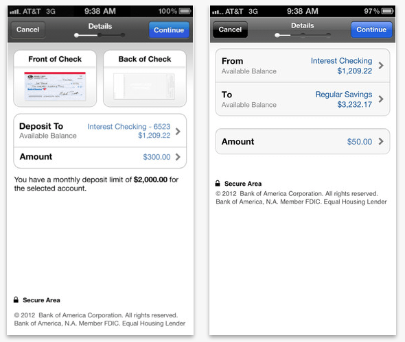
Bank of America’s mobile application allows users to take a photo of a check from their smartphones and have it deposited directly into their account. This feature is unique to their mobile app and is a perfect example of where an app, not a responsive website, is the answer, Kilgore said.
Bank of America created and executed an app that delivers positive user/customer experience, and that’s something all marketers and developers should strive for.
Kilgore said while it’s obvious developing an app to the extent of Bank of America’s mobile banking app (yes, this can be costly), it will pay off in the long run both financially and from a customer service point of view.
“Now that’s Progressive”
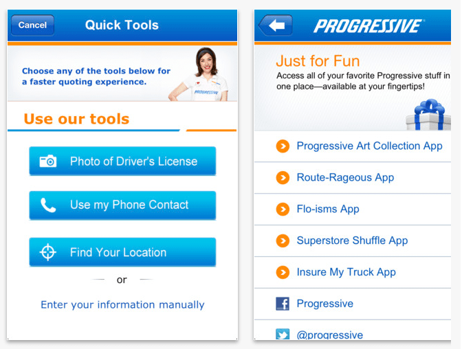
Progressive car insurance has a similar interactive app that allows users interested in receiving a quote to take a photo of their driver’s license and send via the app. It also makes insurance easy and quick to use anywhere and anytime, from paying your monthly bill or filing a claim. You can send a photo of the damage straight from your smartphone.
Don’t have a copy of your insurance policy on hand? The app is loaded with all the information you need in case of an emergency. Baio points out that the AllState Insurance mobile app is very similar in regards to its easy-to-use interface, as well as the fact that the app offers Accident Support during an emergency.
As proven in the aforementioned examples, when a mobile web site or mobile app provides a different user/customer experience, they are surely necessary. But just don’t duplicate the same content and features from non-mobile sites for a mobile site or mobile application.
Starbucks Sets the Tone
Of course, I’d be remiss if I did not mention Starbucks’ interactive and rewarding mobile application.
With the app, you can purchase items from your phone, manage your Starbucks card balance, track your accomplishments in the Starbucks Rewards program and find the closest stores, get directions, and share your experiences on Facebook.
Maintaining a Mobile App
Is it really a hassle to create an app?
In the wake of the iPhone 5 and Galaxy S3 launch, it’s clear that there are multiple platforms that exist with these phones. Not so long ago, developing for each platform was time consuming, but today there is framework that can streamline the development process, Baio said.
Instead of learning the programming languages for each mobile platform, designers can utilize their HTML, CSS and Javascript skills and deploy an app at once. PhoneGap provides designers with the necessary means to create mobile apps for iOS, Android, Blackberry, etc.
Responsive Is the Way to Go
When weighing the pros and cons of developing a separate mobile website, an application or a responsive site, first consider who will be using whatever it is you decide to create. What’s going to lead to the highest level of customer satisfaction, retention, and play a positive role in your marketing efforts?
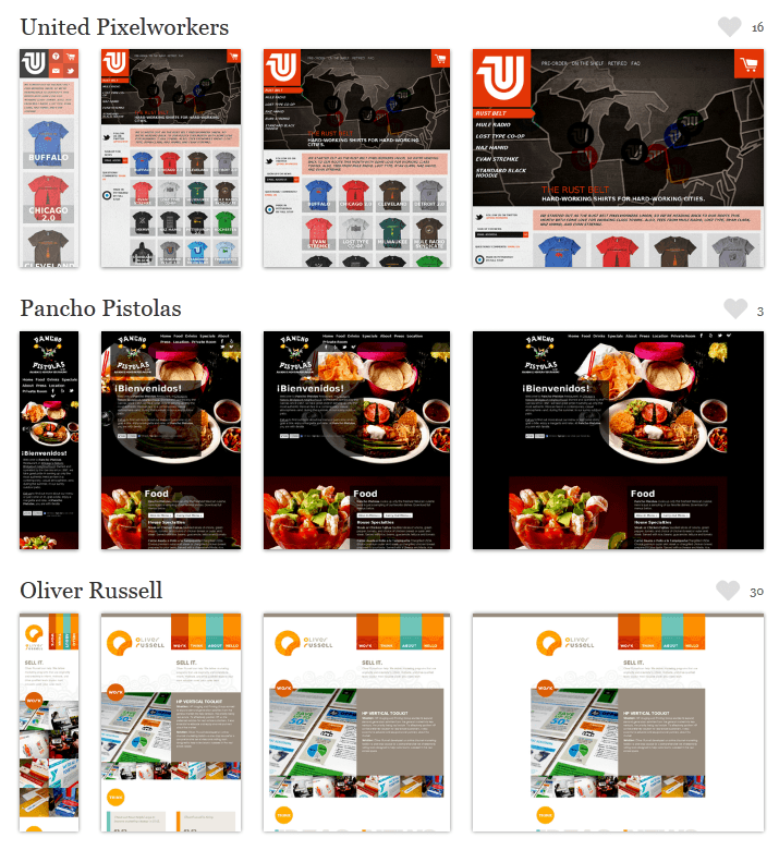
The Boston Globe (heavy content) and Grey Goose both have exceptional responsive web sites.
Courtesy of MediaQueri.es
For that reason, the debate will continue for many years to come. And as technology advances, we could see additional options thrown into the mix. Perhaps the best advice, according to Kilgore, is to understand the goals of your company, your intended audience and what will create the best user experience. Once you have those answers, you can develop your site accordingly.


What business owners do not realize is that direct communication still has a very profound effect on their customers, and text messaging is as direct as you can get. Imagine if you can combine the flexibility and convenience of social networking sites, and the intimate, powerful effect of a text message.