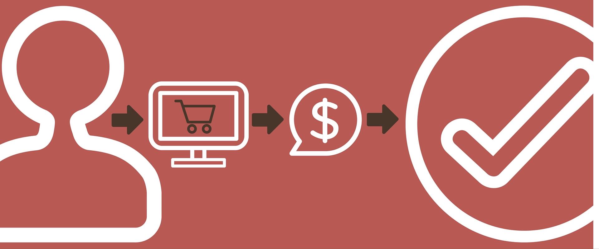
If you’ve ever been to Chipotle during the peak lunch and dinner hours, you understand how their employees use teamwork and seamless flow to get you down the service line and through checkout. There are no unnecessary movements, no obstacles between one station and the next. This is exactly how ecommerce UX (user experience) web design should work on your website.
With ecommerce web design, the ultimate end goal is to sell products to customers. But how do you lead them to that point of conversion?
Make Your Ecommerce UX as Efficient as Chipotle’s Service Line with These 5 Actionable Tips:
1. Minimize
Chipotle can serve fast and fresh food immediately because their menu is limited and streamlined. Choose a type of rice, choose a meat, and move on down the line. Your homepage menu options need to mirror this strategy. Too many main menu and sub-menu choices will overwhelm your potential customers.
Avoid complicated menu options and product listing areas to minimize distractions. This will make it easier for customers to find what they’re looking for on your site quickly.
2. Create a Clear and Simple Ecommerce Flow Path
The service line at Chipotle is widely recognized for its efficiency and speed. This would be impossible without the fool-proof path the customer takes down the assembly line. What if, after an employee scooped some rice into your bowl, they took you down to pick out a drink before scooping meat and everything else? That would be an inefficient and confusing route for any customer to take.
For ecommerce websites, internal links through the checkout process facilitate the same sort of pathway. When sites don’t include internal links or have an unclear checkout process, the result is confusion and, possibly, loss of a sale. From the time a potential customer clicks on a product, it should be obvious what steps to take next. By making this process complex, you’re essentially putting up barriers between your customers and the purchase button.
3. Strategically Place “Expeditors”
Another aspect of the service line cited as a key factor in Chipotle’s efficiency are the extra assembly-line employees placed in strategic locations. There are always peripheral team members in position whose jobs are to fill gaps and expedite the checkout process. They’ll help wherever needed and do any necessary extra packaging in order to get you on your way.
Just like these employees help when you remember you want an extra side of salsa, CTA (or call-to-action) buttons are designed to expedite the conversion process online. CTAs must be placed in an accessible location and should offer to take the customer to exactly what they’re looking for. For example, when someone is browsing for information on a hotel website, there should be CTAs that give the chance to “Book Now!”
Again, it’s all about leading the customer through the process of deciding to buy from you in seamless steps.
4. Keep it Secure
Have you ever accidentally reached your hand over the glass barrier at Chipotle in order to point an ingredient out? If you have, you’ve gotten a gentle reminder to please keep your hands on the other side. This is to protect against germs, and it makes complete sense.
Obama may be the president and all but this is unacceptable pic.twitter.com/ucASPsShFD
— Steph B-More (@StephBMore) June 24, 2014
The “s” in the “https” of a URL accomplishes the same thing. “S” stands for “secure,” and is obtained with Secure Sockets Layer (SSL) protection. All websites that ask for customer information (like credit card information) should have this to protect against hackers and identify thieves.
Just like you would walk right out of a restaurant with sub-standard cleanliness, many customers will not make purchases from websites that are not secure. Find out about Secure Sockets Layer and how to get it here.
5. Maintain Transparency
Part of the reason customers love the experience at Chipotle is that they get to see their food being made right in front of them. They can correct mistakes and see the entire process. People love transparency. And customers get this both in the store and behind the scenes. One of the restaurant’s biggest selling points is that they get all of their ingredients from ethical sources. This means the meat is raised responsibly and the vegetables are local, among other things.
When creating ecommerce elements on a website, experts agree that displaying the shopping cart contents in a clear way is very important. This means that quality product images, product descriptions, customer reviews, and other details of the order are essential parts of the checkout phase. This creates trust and makes it easier for guests to check over their order.
Thoughts on Ecommerce Web Design
Just in case you didn’t catch the trend here, most of this advice is about making the shopping process easy for your customers. This is the number one priority (besides information security) with ecommerce UX and it cannot be overstated. Chipotle understands this. That’s why they make the process as fun and quick as possible – and you should too.


