Last month, Twitter changed their logo. They killed one bird with one stone (or maybe with one graphic designer?) and debuted a new one. Here are the old logo and the new logo side-by-side:
Twitter gave the bird a buzz cut and a wing-lift, so he’s now a little sleeker and maybe even more aerodynamic. Twitter also burst the bubble-letter logo that was previously used to represent the social networking site.
By eliminating the logotype, Twitter is now solely represented through its bird symbol, a la Apple or Nike. Here’s how Caity Weaver at Gawker described the logo change: the mascot was “transformed from a bird that looked like how it used to look into a bird that still looks like how it used to look”. But, according to the social network formerly known as “t”, the bird is a metaphor. Consider this poetic description posted by Twitter in a blog post:
“This bird is crafted purely from three sets of overlapping circles – similar to how your networks, interests and ideas connect and intersect with peers and friends. Whether soaring high above the earth to take in a broad view, or flocking with other birds to achieve a common purpose, a bird in flight is the ultimate representation of freedom, hope and limitless possibility.”
This lyrical writing makes it clear that the new bird is far more than a simple winged creature: it’s a symbol of human interconnectedness and the values that people around the globe esteem. That’s one formidable fowl.
It’s Bigger Than a Bird
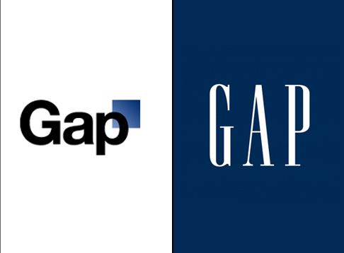
Twitter’s logo change prompted me to start thinking about logos in general and the way in which they relate to branding. Companies and customers put a lot of stock in logos. In October 2010, Gap unleashed a firestorm when it changed its logo; consumers criticized the new logo so much that the clothing company abandoned it and reverted back to basics with its original one.
Because logos are such public symbols, a lot of time, money, and thought go into their design. Businesses have to create logos that are visually appealing and unique, but, as evidenced by Twitter, a logo is a lot more than a sophisticated graphic design. It is also a symbol rooted in meaning. It’s bigger than a bird. For Starbucks, it’s bigger than coffee. The Starbucks logo is a twin-tailed siren that captures coffee’s seafaring history and the seaport roots of Seattle (where Starbucks was founded). She’s not just a face on a coffee cup; according to the Starbucks website:
She is a storyteller, carrying the lore of Starbucks ahead, and remembering our past. In a lot of ways, she’s a muse: always there, inspiring us and pushing us ahead.
Companies can wax philosophical on the meaning of logos, but when it comes to putting abstract ideas on paper, they shell out a large amount of cash. Pepsi’s 2008 logo redesign took five months of research and cost approximately $1 million, leading to a very pricey pop-can insignia.
Logo creation can be a million-dollar business. Obviously a logo is the most basic symbol of a brand and resonates with society. The Apple logo is instantly recognized by virtually everyone. But, can a logo make or break a brand? How crucial is a logo in a brand’s success?
Shedding Some Light on Logos
I turned to the experts, and here is what they had to say.
1. What a Logo Doesn’t Do: Describe a Business.
Paul Rand, a graphic designer who created logos for corporations like IBM, UPS, ABC, and Enron, had this to say about logos: “a logo doesn’t sell (directly), it identifies”, and “a logo is rarely a description of a business”. Take Chanel:
If someone had never seen this logo before, they would have no idea that Chanel sells high fashion items; the universally recognized symbol doesn’t sell clothes, it is identified with clothes. Rand talks about another company, Mercedes. He says, “The Mercedes symbol, for example, has nothing to do with automobiles; yet it is a great symbol, not because its design is great, but because it stands for a great product.”
2. What a Logo Does Do: Embody the Qualities of an Organization.
Tom Geismar, a graphic designer who designed the logos for Mobil, PBS, National Geographic, Xerox, and New York University, says that logos morph from designs on paper to symbols charged with meaning; eventually, they come to “embody all the qualities of the organization they represent”. Logos can even get tangled up in public opinion. Consider the McDonald’s logo:
I do not eat at McDonald’s, and I don’t particularly like the fast food eatery. So, whenever I see the golden arches, I have an adverse reaction. Logos are like classical conditioning. Pavlov’s dogs heard the bell and salivated; I spot the McDonald’s logo and cringe (though, to be fair, I’m sure a lot of people see it and have a positive reaction). This leads me to the next point.
3. A Good Logo Won’t Make a Brand.
Graphic designer Brian Hoff has also weighed in on the connection between logos and brands; according to him, “a memorable logo is just the beginning – yet an extremely important beginning – that sets the overall tone for your new or existing brand”. Logos are important, but they’re not the whole picture. Brands can’t live on design alone. Paul Rand sums it up nicely: “a logo is less important than the product it signifies”. What it means is more important than how it looks. Rand says that if a company is second rate, people will see the logo as second rate. Brands are composed of more than a cool, clever emblem: they’re made up of employees, the services they provide, the products they sell. Tory Burch, a fashion designer whose brand logo has become widely recognized, made a great point on the all-encompassing nature of a brand when she said a brand is “everything from the initial hangtag, to the logo, to the packaging, to obviously, the product”.
Think Outside the Logo
So, with all these design experts voicing their views on logos, what’s the bottom line? Logos are important, because they lay the groundwork for a brand, but logos are only as good as the brands they represent. When companies offer high-quality products and deliver good customer service, people will view their logos in a positive way.
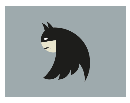
People might even view their logos in a creative way. Like by flipping the Twitter bird upside down and realizing it looks like Batman; or a person with a mullet; or Sonic the Hedgehog.

